24 HOUR INFOCITY
The City of Sheffield
From an initial long list of 167 companies, we found ourselves competing against Ordnance Survey in a bid to design maps and signs for our biggest sign project to date — the whole city of Sheffield. We won the pitch, (against the organisation that practically invented the modern map!). We were appointed as designers and cartographers on a highly ambitious on-street project in Sheffield, charged with making sense of the pedestrian signing for the whole city.
Our detailed research and collaboration with the design team led us to a unique solution using modular pedestrian 'hubs', creating features such as intuitive photography, interpretation, reductive mapping and a city plan to aid journey planning. Each hub is even illuminated to allow 24 hour visibility. An award-winning, 'one stop' solution and a first for Britain, the scheme tested extremely well in user comprehension, winning an international LAUS award and runner up in the Design Week Awards.
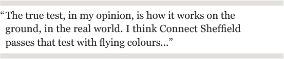
Accolades apart, Ahmed Yunus, project manager for Sheffield City Council commented thus:
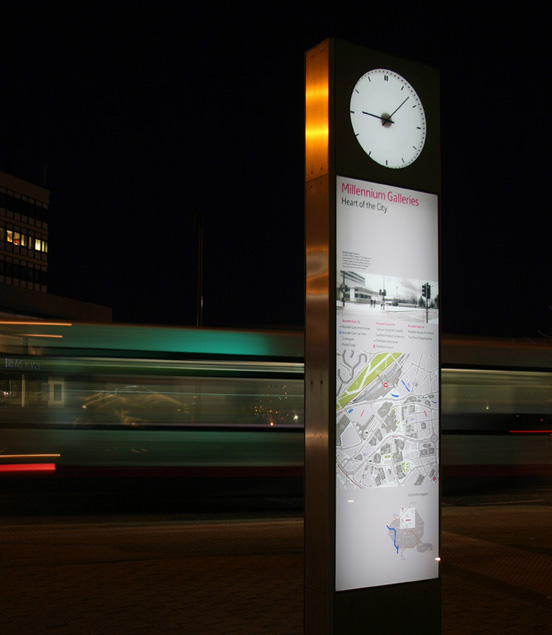
Connect Sheffield 24/7: over 120 illuminated photographs, maps & diagrammes provide user-friendly information 'beacons' throughout the city
PROJECT OUTLINE
'Connect Sheffield' is UK's the first fully integrated pedestrian wayfinding and information system. It links public and private transport and pedestrian information in a presentation which is easy to understand and multi- layered. Unlike the the familiar city clutter of finger posts, out-of-date maps and signs, the redundant existing signs were removed in favour of a single, consistent approach. Key stakeholders include The South Yorkshire Passenger Transport Executive, the two Universities and Healthcare Trusts together with Sheffield City Council. Characterised by simplicity and modernity, the primary product for Connect Sheffield is a pedestrian wayfinding 'Hub' which uses mapping, intuitive photography and a city plan to aid journey planning. Each 'Hub' links to a system of bus and tram route information at shelters and stops which ensures clarity and continuity as people interchange between pedestrian and public transport services. Units are carefully located to 'connect' with the maximum number of people at key navigation intersections across the city. The chamfered stainless steel edge frame allows the graphic content of each hub to bleed fully to all edges. It also acts to protect the back lit low ion glass information panels from physical damage.
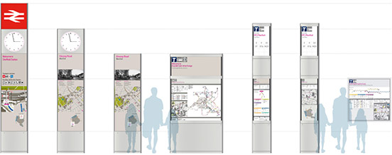
The modular sign 'family' is incredibly flexible, adapting to bus & tram stops and the train station
The physical manifestation of the product was the responsibility of product designers Pearson Lloyd. The ambition was to make information delivery the hero, something we enhanced through the development of a clear information hierarchy. This led to the reduced aesthetic of simple information 'totems' of various sizes. This 'volumetric' approach allows different scales of product to exist in response to specific needs in different locations. The vertical hierarchy also allows more specific elements such as a clock and travel icons to be included at transport hubs. This was successfully tested on the streets of Sheffield.
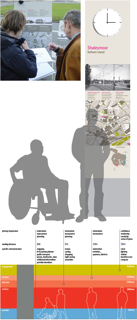
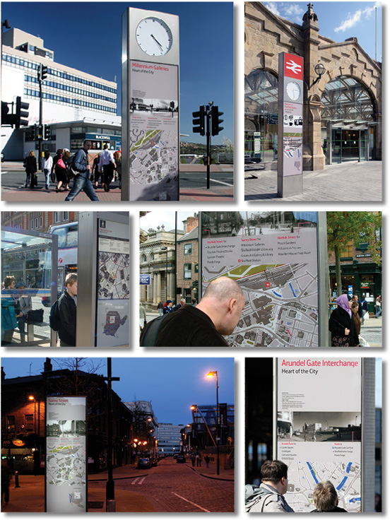
A modular 'totem' design responds directly to the informational needs of the user; annotated photographs and mapping encourage a more intuitive understanding of routes
The scheme is comprised of an extensive network of on-street information delivery including pedestrian map panels, bus stop flags and tram stop displays. The process was guided by City ID, who researched an in- depth understanding of Sheffield's geography, districts and neighbourhoods. Underpinning the range of information design elements is a robust hierarchy and methodology for information planning that delivers appropriate information with consistency and continuity for all users including residents, visitors and the business community.

Our contemporary adaptation of a Sheffield-derived font is designed to be distinctive and instantly legible, with unusual features such as a ligature set
The design of the information itself focused on clear and consistent use of typographic styles designed to be read at distance. We felt quite strongly that the integrity of the mapping depended on creating a unique identity for 'Connect' Sheffield and controlling the presentation of the information. By designing a bespoke typeface, both of these could be guaranteed. We were fortunate in finding ideal reference in the typefaces of the Stephenson Blake Type foundry, which was established in Sheffield in 1819. We chose a sans serif font, 'Granby', designed in 1930, as a starting point from which to evolve the 'Sheffield Sans' typeface. Working with Jeremy Tankard typography, 'Sheffield Sans', was designed to achieve a strong, contemporary personality with the rigorous performance criteria of a sign font.
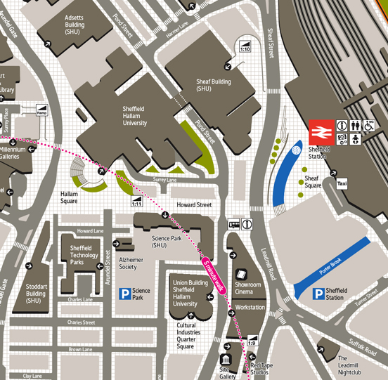
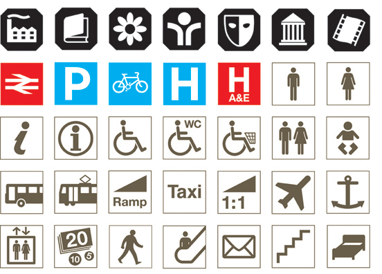

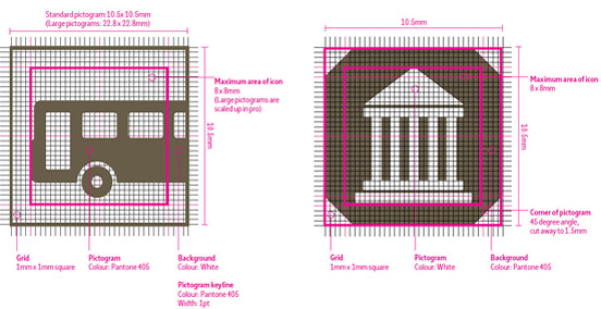
To aid comprehension and navigation, 'heads up' pedestrian maps highlight only relevant features of the city, with a simple city outline showing location and key transport routes. A bespoke pictogram set including 'Hallmark' icons flag unique Sheffield features. These were created with reference to Sheffield's Assay office - the busiest in Britain.
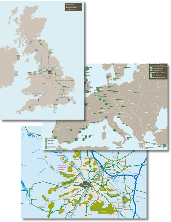
The mapping suite is extensive and royalty free, allowing wider distribution amongst the city partners. Photography also allows for interpretative information on important city features.
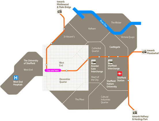
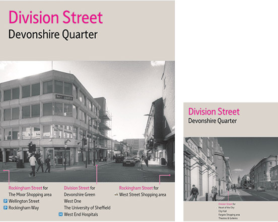
Diagrammatic transport maps use clear colour contrast to distinguish routes and are designed to be engaging and easy to use, with the timetable information and related travel guides. The mapping suite also includes a comprehensive set of print and web maps. To address the problems many people have with complex cartography, the product includes a new photographic wayfinding element. Photographer Phil Sayer produced over 120 dynamic cityscapes, each presenting the immediate viewpoint from where you are standing, present visual information in a 'real' context. These are annotated with key directional information and show interpretative notes on key buildings or historic and cultural features. The system was implemented between November 2006 and April 2007, and has been engineered to be easily updated as Sheffield physically evolves and new graphic technologies emerge.
Design team: City ID: wayfinding consultants & project managers, Atelier Works: Graphic & cartographic designers, Pearson Lloyd: Product designers Endpoint: Production specialists