03.09.2014
BAG LADY
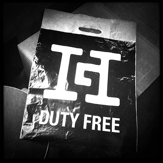 Whilst I was waiting for my morning train the other day, I spotted a lady with a very special bag.
Alan Fletcher - if you don't know him try this or this - is a designer I worked for, and with, and admire without limit. Sometime in the 1960s he designed a logo for a German company, Gebrüder Heinemann, that sold duty free goods at various airports.
The logo is an H for Heinemann, with the G for Gebrüder wonderfully cleverly hidden as a negative shape. A version of the counter inside the H. Alan has increased the amount of visual information you need to read the non-existant letter by using big bracketed slab serifs. It is a tiny triumph of positive and negative. One letter that is, by a stroke of magic, two letters. As a piece creative thought, followed by flawlessly precise typographic engineering it seems greater to me than the oft shown "mother" by Herb Lubalin, which is okay as an idea but unremarkable in execution, or the ridiculously overpraised FedEx logo, designated as "legendary" in gushing American hyperbole for its afterthought arrow.
I have always loved this logo, what Alan would have called a monogram, since first seeing it nearly thirty years ago. It seems to me a kind of miracle that this bag was on my station platform. I rushed out of the station to a shoe shop, bought a bright red 'shopper' with fake brass buckles for £5, rushed back onto the platform, swirled over to the astonished lady, breathlessly explained how I wanted to swap the new red bag for her crumpled plastic bag, and did so, all before the train arrived.
Alan went on from being a freelancer to form Fletcher/Forbes/Gill in 1962, and then Pentagram in 1972. The logo was done sometime in the freelancer-F/F/G period - I remember having a conversation with Alan about it.
The logo does not appear in Pentagram's first book. It does appear in the second book, Living by Design (1978, Lund Humphries), no date, just this:
Gebrüder Heinemann, or Heinemann Brothers, a German company who retail duty free goods. The brief was for a monogram based on GH, in which the letter H needed to be dominant. This was achieved by a use of typographic licence and figureground - the G is only seen if the H is background.
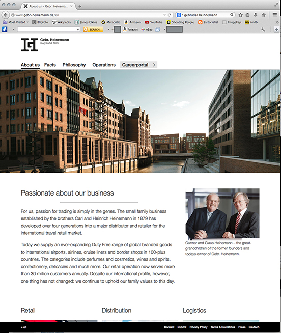
Pentagram's current website shows the logo, but with no explanation and no date. It was never Pentagram's work in the first place, it is an heirloom. And like the vase that came from Grandpa, you tuck it away somewhere. (Without any idea that it is original Ming.)
Design is a funny business. On the one hand it is a business, we have to sell to stay alive. And this need to sell tends to make us puff work up, to gloss it with positive adjectives, to overclaim its effectiveness. On the other hand, design is an art. It is hard to make good stuff, let alone truly great things. The judgement that coldly grades design as good or not quite as good has no part in the daily bustle of earning a living. Diamonds like the Gebrüder Heinemann monogram easily get overlooked.
As for the Gebrüder Heinemann company, they appear to be thriving. I wonder if the two current CEOs commissioned Alan... I should write. They might send me another bag.
Quentin Newark