22.02.2021
THE LIFE AND TIMES OF THE HUMBLE ARROW
Lecture delivered to the Sign Design Society, 2001
If you don't know where you are going, all roads lead to one place; according to the Roman proverb. Lacking any particular direction myself, I ended up working on a number of large sign projects during the 1990s. As a graphic designer more comfortable in attending to the spaces between letters, my mind was totally unprepared for the mental gymnastics required to comprehend three-dimensional spaces, read plans, and take imaginary tours around very complicated public buildings. I spent days in these places; ignoring the stares of passers-by while I peered around corners, over balconies, and paced purposefully up and down walkways. What slowly absorbed me was meeting the principal wayfinding challenge: how do you coax people into taking one route over another?
And so I became fascinated by the persuasive powers of type, colours and pictograms. The arrow, in particular, has always interested me, since it didn't seem to matter how wonderfully original and startling a sign design appeared to be, nor how readable and consistent the type was. The motivating factor in directing a visitor one way or another was the pictogram they saw first: the arrow.
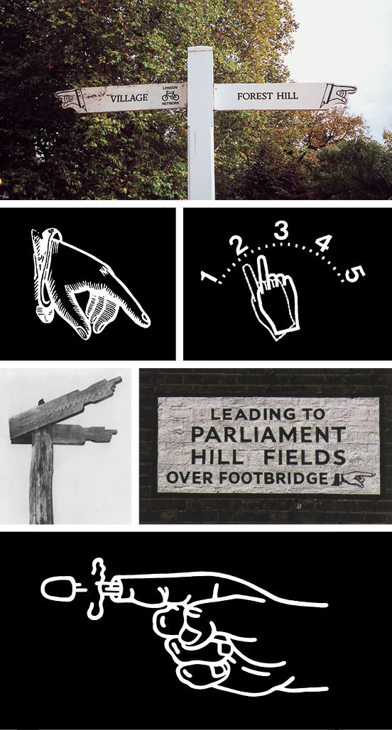
The demise of the pointing finger. These old signs are now regarded as a 'heritage' item in our towns and countryside. The pointing finger never really worked at 45°, it looked a bit limp and indecisive. It would never work on a car fuel-gauge (Yukio Ota) so perhaps it should be put out of its misery, shot, and left for dead (Shigeo Fukuda).
Has it always been an arrow? As a young boy I seem to remember countryside signs with pointing fingers leading me across vast muddy fields and down high-hedged lanes. I had an great affinity for these signs; I trusted them simply because they had a human form — I'd go anywhere they directed me. However, the pointing finger is not so common today. And I find it strange that in the digital age of geo-positioning systems, we use instead a pictogram of one of our ancestors' earliest killing instruments.
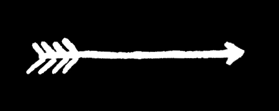
Handed a bow and arrow, we may instinctively know what to do with it; arrow to bow, draw back, aim and release. Where does it go? The flight of an arrow is straight from archer to enemy, or direct from A to B. There is no concept of deviation from its intended target, and its flight is swift. This is an appealling and an evidently lasting analogy that has stayed with us for thousands of years.
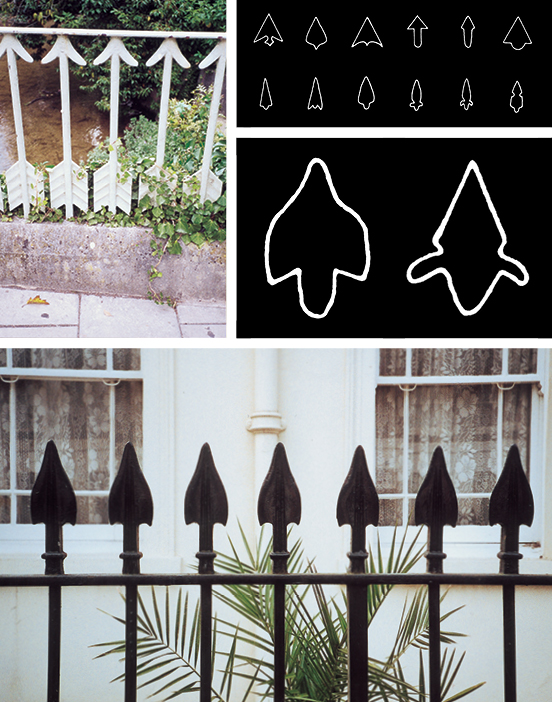
Upended iron arrows on a countryside bridge. Archeological study of Stone Age arrowheads from Africa. Compare the outline of the Stone Age arrowheads with the profile of the capped railings outside this typical London town house.
The form of the 'killing' arrow goes back a long way. Archeological studies of Stone Age flints reveal ingenuity worthy of the modernist design maxim 'form follows function'. Some arrowheads were sleek, fashioned to pierce tough animal hide; others had barbs to embed themselves; and some were just simple broad-heads intended to stun. More than 10,000 years after the Stone Age, we continue to fashion new graphic arrowheads.
If you look carefully at the railings outside period town houses, you may notice arrowheads as decorative terminals to iron railings. Or are these railings arrows that have been planted upright to create a dangerous barrier? Harking back to our primitive past, upended arrow railings are actually a sign telling us 'don't come here'.
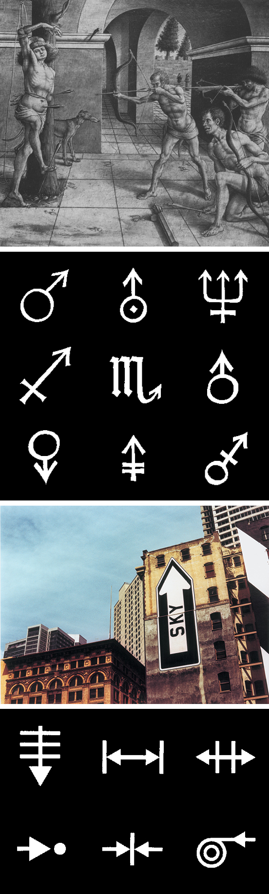
Arrows in religion (The Martyrdom of St Sebastian, 15th Century), alchemy (emanating from Greco-Roman astronomy symbols), art (Sky/Ground mural, Rigo 23, USA, 1998), and science (biology notation).
Despite this, the arrow as a graphic shape can morph to describe different types of movement, such as speed. Arrows have been used by graphic artists to explain complicated ideas. Conceptual artists use arrows to startle. Mystics see the arrow as representing inspiration, a directed energy for some uncertain purpose. Conversely, scientists use the arrow in formulae to describe a proven reaction.

Arrows in branding; British Rail (DRU), FedEx (Landor Associates), National Express, Royal Bank of Scotland, National Westminster Bank (HSAG), HSBC (Henry Steiner).
In the trademark arena, the arrow is ubiquitous and most prolific within the transport sector — for the reasons described above. The banking sector has progressively ditched its traditional symbolic representations of safety and security, and adopted the arrow in order to emphasise its dynamic global reach. Presumably, world-wide coverage is now more important than security to the average wage-earner needing a method for paying household bills.
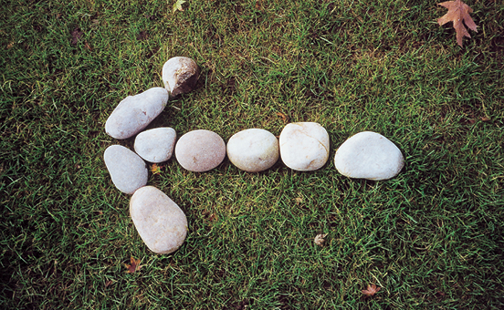
It seems to me that the arrow is a loaded symbol, capable of delivering an infinite number of messages. Even the most rudimentary arrow-shaped sign has the power to save lives. Take, for instance, the two short lines of stones intersected with one long line of stones. Baden-Powell taught his Boy Scouts to use this method of laying down trails, so that rescuers could be led to lost souls.
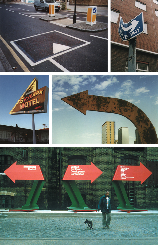
Lost without the arrow? Imagine our cities without arrows (my local high-street is festooned with insistent arrows). America is so vast that arrow signs are everywhere. An original Brasilia city sign (from the film 'Vacancy', 1999). Temporary arrows create a mini-city for the London Docklands Corporation (Pentagram, c.1985).
We would all be lost souls without the arrow. Matthias Müller made Vacancy, a short documentary film about Oscar Niemeyer's futuristic and totally out-of-scale city, Brasilia. In the film he describes the city as 'an emptiness hidden beneath a thick coating of signs' and concludes that 'this city repeats its signs so that it can begin to exist'. What would our cities be like without the arrow? If all signs with arrows were removed, would we continue to have city centres and city suburbs? I think not. Furthermore, we need arrow signs to create cities; the London Docklands being one such example. Once the largest trading port in the world, it was heavily bombed during World War II and then left poverty-striken and desolate. Before reconstruction began, the developers installed giant sculptural arrows to direct fleets of tipper trucks across a roadless wasteland. Now that wasteland is a major financial and technology hub for the City and the population of the area has more than doubled. On an even grander scale, the United States exists as a country made by signs — staked out from the East Coast to the West. That love affair with the sign is at its most profligate in the gambling city of Las Vegas, and at its saddest in the fading, rusting structures outside the forgotten backwater motel. For all their exuberance, these arrows often promise far more than they can actually deliver.
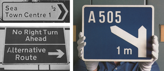
Belief in the arrow. Accompanied by words, an arrow becomes convincing — even when the information is illogical. These examples from the 'The Times' newspaper prove the point. Thankfully, more sensible signs are provided on Britain's motorways. Designed for reading at high speed, these arrows forewarn, instruct us to manoeuvre, and guide us on to new roads (Kinneir & Calvert, 1958).
Can we still trust the sign of the arrow? It would appear that we continue to have an unquestionable devotion to the pictogram, although less so when accompanied by words. Readers of the The Times contributed many humorous examples in a long-running feature during the 1970s. While belief in the printed word has become somewhat diminished, words assigned to an arrow still have credence — so much so that we will hurtle along at 70mph (or faster) on the nation's motorways, veering one way or another, according to a line of type and an arrow on a blue-and-white sign. How trusting of us.
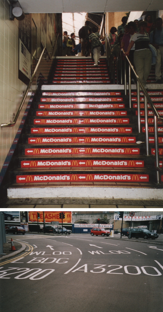
Yet the arrow is an over-used pictogram. It is flaunted wantonly on our streets, directing us to fast-food outlets, and it confuses us on multi-lane roundabouts. Is this death by arrows? What does the future hold for the arrow?
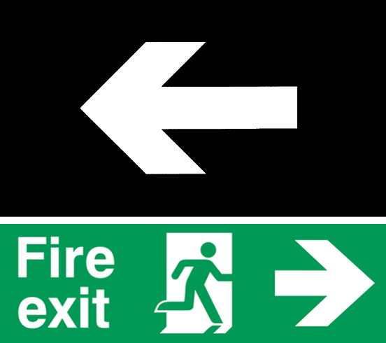
ISO 7001, the new arrow to be trusted worldwide.
Sttandardisation is one option according to the International Standards Organisation directive number 7001 and ratified by Member States in 1985. After five years of development and at a cost of ¥10m, ISO 7001 launched the international emergency exit sign on the world (that's the green-and-white sign with the man running out of the open door). Belgium's contribution to the project was the arrow, specified as having an arrow-head clipped in parallel to the main shaft, with the barbs set at a magical 86° angle, and an arrow shaft being longer than any other line, to signify direction. All logical stuff, but the problem now is that this arrow has assumed supremacy. It looks as if the thousands of years of continual evolutionary development is about to stop; any further creative development is impermissible; and that the ISO 7001 arrow is to be served up forever, as bland as a ready-made microwave meal.
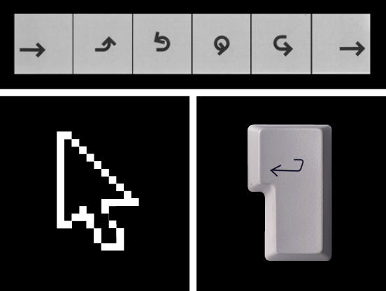
New arrows. Arrow symbols developed by IBM in the 1970s for use on their products. Today's on-screen cursor. Some of the arrows we all use every day.
The arrow has adapted and developed according to the demands of its age — it was a killing tool that became a harmless metaphor and a pictogram to which we now regularly entrust our lives. Is the ISO 7001 arrow really the end to this story? No, the arrow continues to take on new forms, appearing on keypads and touch-screen displays. Products marketed globally will increasingly rely on clever pictograms to unlock the seemingly endless potential of new electronic devices. And as products get even smaller, the miniaturising of buttons will depend on the arrow to guide us from one instruction to the next.
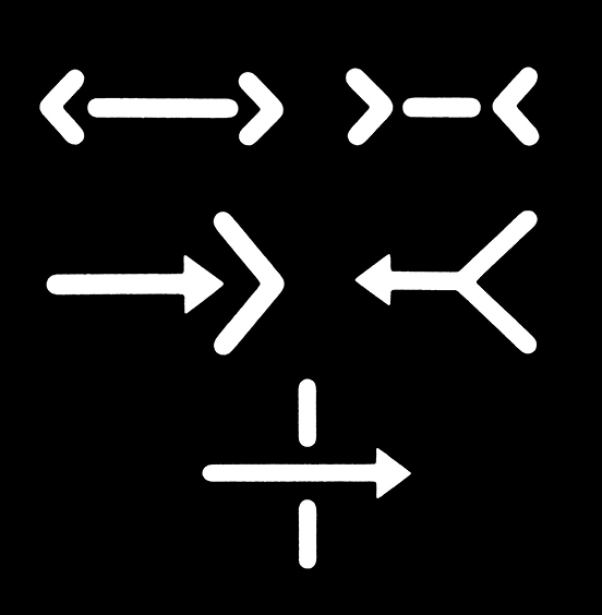
The future for arrows. Examples from LoCoS (Lovers' Communication System), a new pictorial language: far, not far, pull, push, pass through (Yukio Ota, 1964).
Looking ahead, the arrow inherently points the way. Japanese designer Yukio Ota has been developing a simplified communication system using pictograms. As one would expect, his LoCoS word system exploits the arrow to describe activities. It underlines the seemingly inexhaustible tasks to which the humble arrow can be assigned. Ota's experiments are based on Chinese kanji systems of writing, and he sees his work as a 'new weapon' in the battle for 'mutual understanding' on a worldwide scale.
The arrow has been travelling along on its own evolutionary path for thousands of years. As new arrows appear on new products and in new languages, the idea that the humble arrow could guide us towards a future of closer understanding is quite uplifting, isn't it?
Ian Chilvers
![]()