01.07.2019
35 YEARS AGO
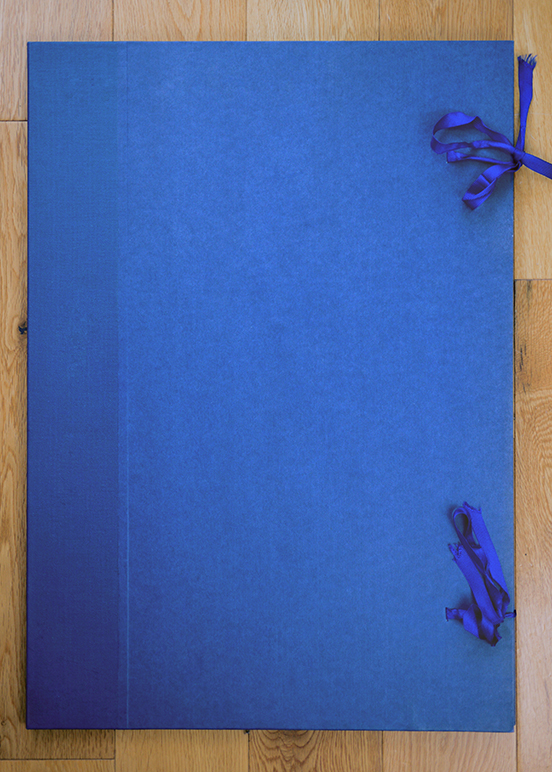
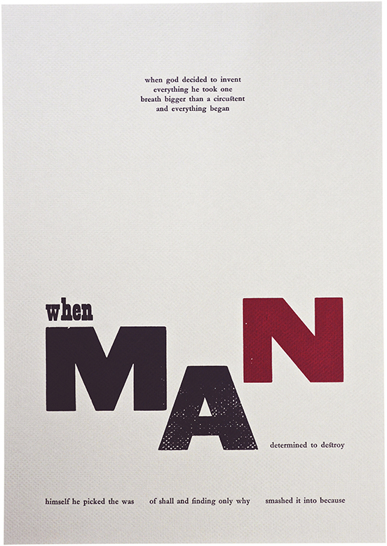
Rummaging around in the Atelier archives, I recently found my one college project that didn't get incinerated in the post-graduation-show bonfire. This hand-made blue buckram portfolio is one of an edition of 12, each of which held 12 letterpress posters. They were the centrepiece of my 1984 degree submission, and their rediscovery triggered a timely moment of reflection.
The project represents a significant moment of technological change, when I witnessed skip-loads of letterpress equipment dumped, and specialist technicians dismissed. It didn't seem right to me, and I was conscious that certain skills were being consigned to history. I went looking for the last journeyman compositors in the college. I found them standing around, without students, and so very willing to teach me. I learnt everything I could from them before they got their cards.
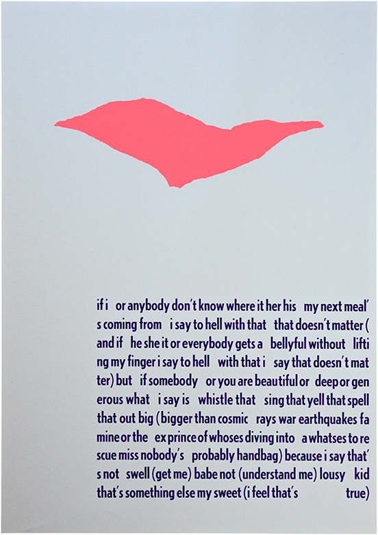
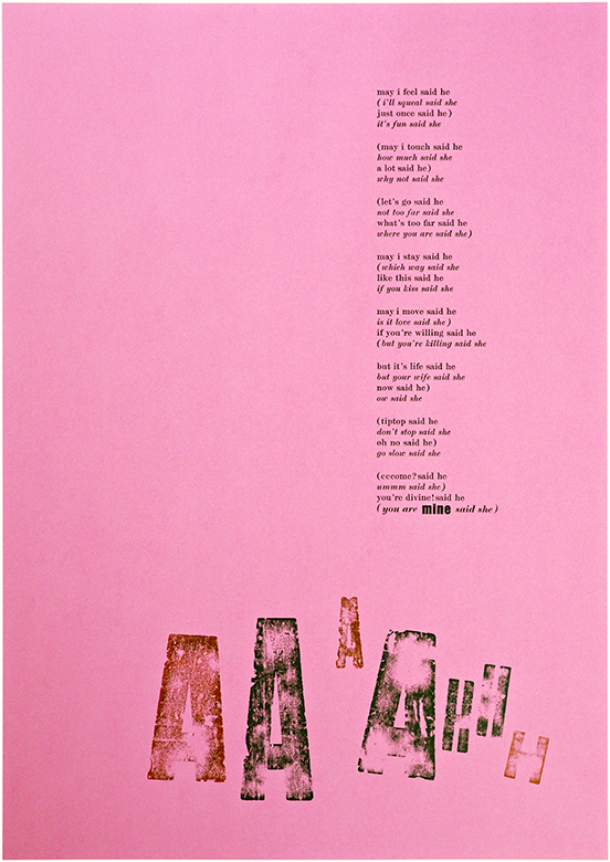
This project also represents a rich student experience; opportunities both practical and academic were central to the syllabus at the London College of Printing (LCP) during the early 1980s. My excellent complementary studies course inspired a fleeting interest in Concrete Poetry. In particular, the American poet ee cummings' conflicting mix of elation and cynicism matched my mood at the time.
Typographically, I was struck by the way cummings 'built' his narrative using type. I asked the compositors to teach me how to build my lines of type and I was then given enough instruction on a printing press to use it myself. The bookbinding department advised me on which papers to source, and taught me how to make my own portfolios. This self-initiated project was a complete design-and-production experience — and it was academically underpinned, with my final dissertation on the British private press movement.
It is obvious now (but not at the time) that it was only by following my instincts that I managed to produce a coherent, consolidated and fairly credible final degree submission.
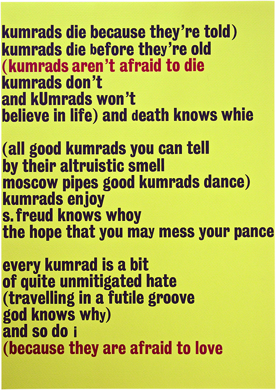
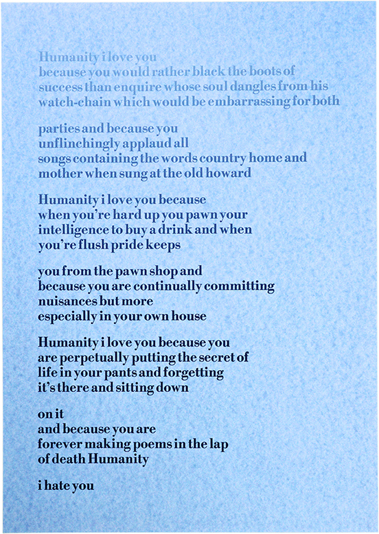
My interest in ee cummings was initially typographic; he was a poet whose work relied on ignoring the rules of grammar and was enhanced by unconventional type-setting. As a wayward student, sometimes at odds with the regimented instruction of my tutors, cummings' stance had great appeal for me. With three deserted rooms packed with letterpress equipment and the whole production process open to me, I was free to go beyond the constraints that cummings had in the 1940s when his poetry was first printed. I could use type and print to explore my own interpretation of his work.
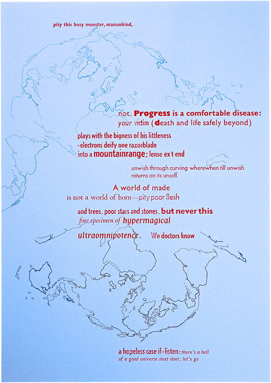
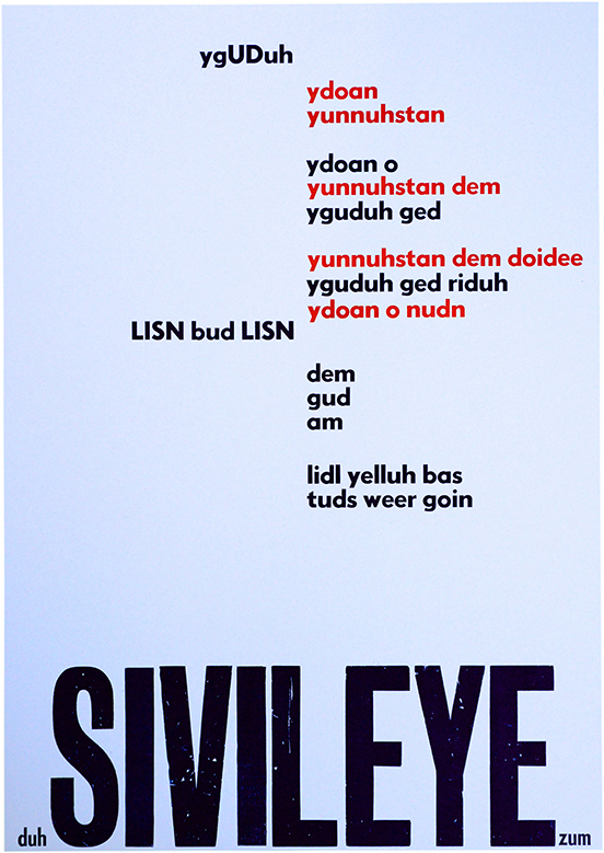
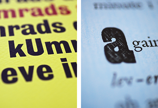
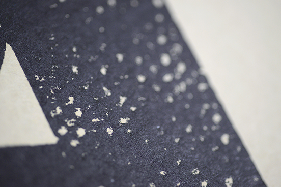
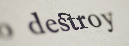
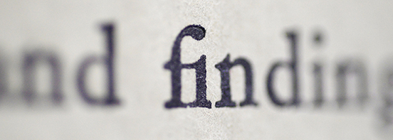
I have to admit that I struggle with today's mobile text abbreviations and chat acronyms. I don't think I'm on the same wavelength. But looking at this poster now, I realise that cummings was using a similar phonetic version many decades before the mobile had been invented. Oddly, I do not recall having any difficulty understanding his poems. Indeed, methodically piecing together these lines using a combination of Ludlow hot metal and wooden type seemed quite straightforward, even when I was setting everything in reverse. There is clearly some valuable research to be done, looking into the merits of slow-paced hand typesetting and reading skills.
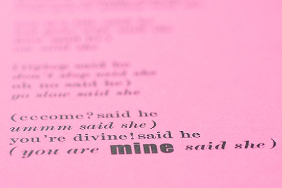
This marked the point at which I realised just how sexy type could be...
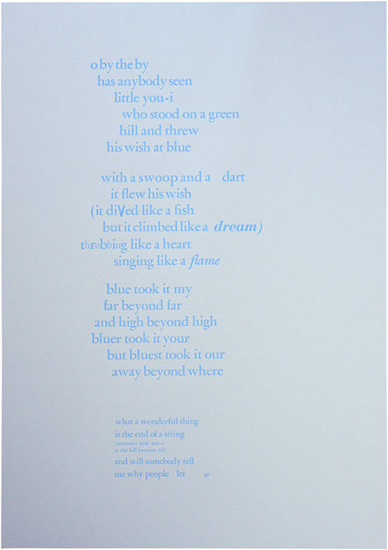
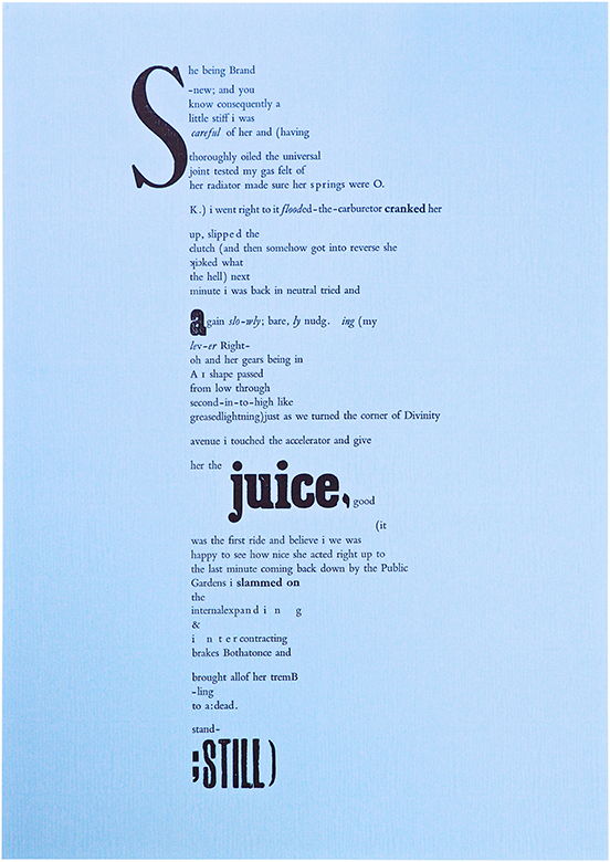
And at this point I also discovered s l o w, fast, and suddenstop type.
Fast forward 34 years...
This year, tens of thousands of graphic design graduates will embark upon their new careers. My daughter will be one of them, having graduated this week from the London College of Communication (LCC). Apart from the change of name (LCP to LCC), this is the very same university and the very same course that both of her parents attended 35 years ago.
For the last three years, mother and father have had to restrain themselves from comparing and commenting on her course experiences, her final dissertation submission, and the preparations for her graduation show. The benefits of our hindsight have been freely offered but (quite rightly), considered unhelpful by the recipient.
Nevertheless, I remain a design graduate and am now an employer, so I am well placed to compare just how prepared today's graduates from LCC may be. On the one hand, the insane student numbers on the course, reduced student-tutor ratios, limited access to hands-on technologies, a reliance on isolated home working, and crippling student debt all conspire to provide a poor grounding for undergraduates and a troubling future for the design profession. On the other hand, hasn't it always been the case that it is the determined graduates (despite their university experience) who succeed in forging new directions in their chosen field?
My optimism remains with this generation of graduates who did not have access to all the resources I had — but should, I hope, leave our arts education system with scorn for how they have been short-changed, making them more alert to workplace deficiencies and more determined not to stand for it. They should not forget to bring their creativity too; perhaps a mix of cummings-like observation with a loud, challenging voice?
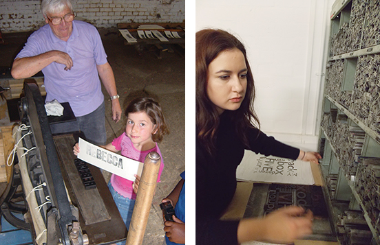
Above, left, my seven-year-old daughter at the Type Archive produces her very first proof.
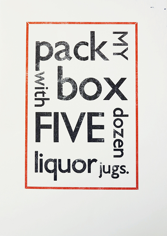
Above, right, my graduate daughter in the much-diminished LCC letterpress department, setting a Gill Sans pangram (below).
Fresh out of university: Rebecca Chilvers
More letterpress: Aladdin's Cave
Ian Chilvers
![]()