HAND LETTERING REVIVAL
Lambeth Council
 Any urban street regeneration has a fairly standard checklist: pedestrian- and cycle-friendly roads, replanted trees, new street furniture (sympathetic lamps, some randomly placed benches or chairs, discreetly placed litter bins), perhaps a piece of art by a local artist, and next item on the list — new street signs. Ordered from council stock, these nameplates are often council-branded and are a not-so-subtle method of 'owning' the regeneration project. Down come the old, dirty and illegible signs, up go the new, shiny municipal ones. Unwittingly, some of our cherished local heritage is lost.
The nameplates in the London Borough of Lambeth have had quite a lot of attention paid to them over the years. See Local knowledge. This is partly because one of the Atelier partners lives in the borough but for the main part, it is because one council employee has had the vision to quietly follow a non-formulaic approach to regeneration. It has resulted in award-winning schemes and a broadening of what constitutes street enhancement. See In van Gogh's footsteps.
This project only came about because of the conscientious efforts of both Lambeth and Atelier to go beyond the standard regeneration checklist — just because it needed doing.
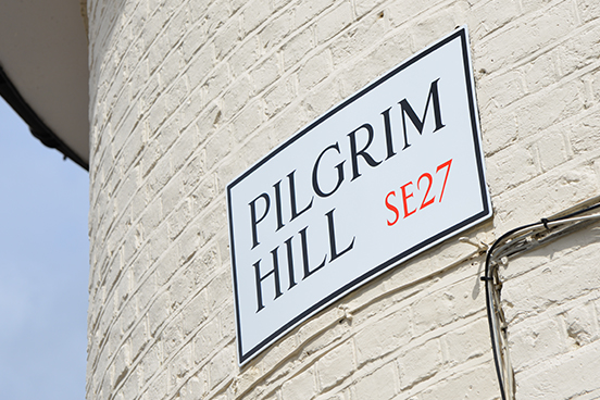
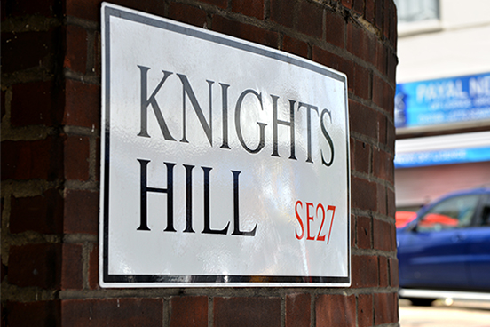
There are pockets in every city, town and village where time has stood still, streets have missed the 'make over' tidy-up, and the features of a time long past quietly cling to the old buildings and walls that define the streetscape. Part of the charm of these forgotten enclaves are the old vitreous enamel road signs. Vitreous enamel is a traditional material made by fusing coloured glass powder to metal to give a tough glazed surface that will resist weathering for decades. The signs' only vulnerability is from corrosion which appears around the edges or at fixing points, where the glazed surface may crack. Over time, these fissures result in a charming and distinctive patina.
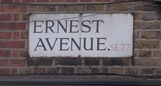
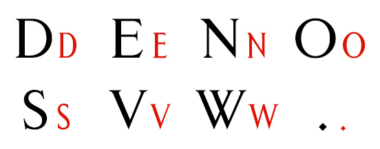
These nameplates have been part of the fabric of the area for at least 75 years, possibly longer. What makes them special? It is not just that they were created using an outdated method or that they have an aged quality. Rather, it is the lettering that makes them unusual.
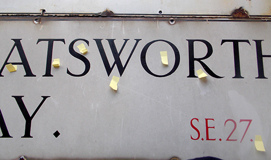
Lambeth wanted to replace the signs of West Norwood in the south of the borough with vitreous enamel replicas so Atelier brought some into the studio to study closely. We discovered that every character was subtly different, concluding that every sign had been hand-lettered. To produce true replicas we would have to recreate the spontaneous and seemingly whimsical style of a late-19th-century sign-writer.
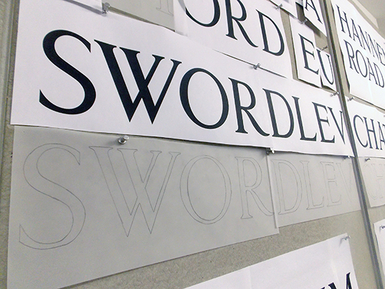

We hand-traced as many letters as possible and then digitised them. Working at actual size, we started to understand how the sign-writer intuitively drew his letters, spaced and paired them. The more we worked with the letters, the more we came to realise that our sign-writer had followed self-set rules and that his style was not at all whimsical.

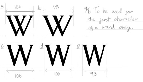
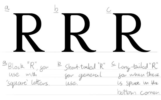
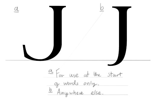
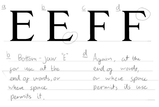
The rules called for a suite of 'alternative' letters. The animation below shows why so many alternative letters were needed.

Where a street name was long, the letters would be slightly compressed. Where a name was short, the letters would expand and tapered flourishes would appear at the end of lines — almost as if our sign-writer was saying 'look what I could achieve if I only had the chance to do something other than street nameplates'. One outlet for this repressed creativity is evident in his ingenious lettering, drawn to make signs physically shorter. Presumably, a batch of short signs meant more powder-coated plates could be crammed into the oven for final firing, so costs were lowered.
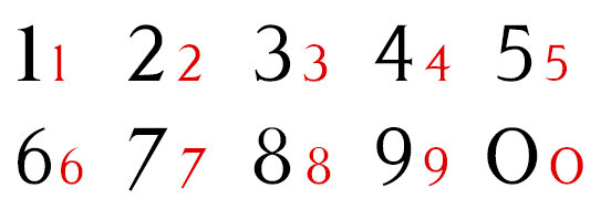
An alphabet was created for the street names and a specific suite of characters was drawn up for all the postcode permutations in the Lambeth area.
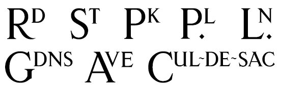
Specific abbreviations were re-created; more evidence of the sign-writer's talent in keeping the length of a nameplate to a minimum. The 'economics of typography' is a now a new field of interest for us at Atelier...
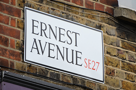
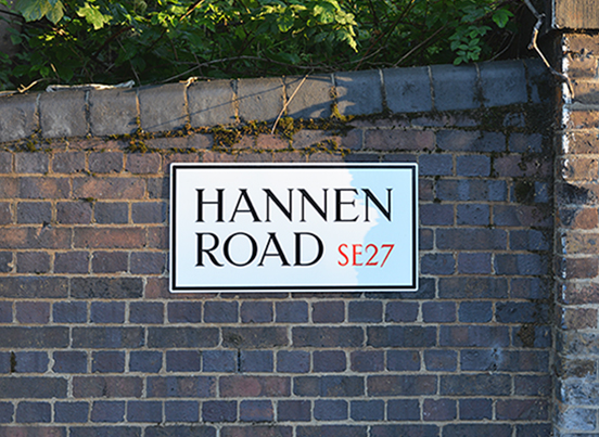
As the old signs in Lambeth come up for renewal, they have like-for-like vitreous enamel replacements. Granted, they look a little new, but given time they'll age nicely and return to being a less conspicuous — though equally elegant — feature.
Postscript
We embarked on replacing illegible street signs in West Norwood. Its hills were once covered by the Great North Wood, from which the Norwood name originates. Sadly, few trees remain and quiet residential streets now sprawl across the hillsides. We named our new font 'Northwood' where we discovered it and the font is now covering the same hillsides in place of the Great North Wood.
Is the Northwood font available to others? No, we don't intend to release it for general use. The font revives the work of a local sign-writer and we think that his craft is a part of the heritage of the London Borough of Lambeth. Northwood helps to define the individual character of the area and we feel that this should be treasured and protected — as should the original lettering on all street signs, wherever they may be.
Other Lambeth projects: Triangulating a Circle, Local Knowledge, Street Collaboration, In van Gogh's Footsteps, Lost and found