HER MAJESTY THE QUEEN
Royal Mail
This set was designed to mark the sixtieth anniversary of the coronation of Queen Elizabeth II. It was not to be the 'usual' Royal Mail stamp commission for Atelier. Here, we provide an insight into the research and lengthy deliberations that are an essential part of designing a set of stamps for a very special occasion.
It has been estimated that Her Majesty has sat for more than 130 official royal portraits. We didn't source all of these during our weeks of research — but our initial shortlist did run to 62 potential candidates by the time we had our first presentation meeting with the Royal Mail.
Arranging our candidates in chronological order and then laying them out on a large table helped us to see what would or would not make a good stamp; compositions where the Queen was in a large landscape, in a big room, or on horseback presented her as too small a figure to be recognised at stamp size. These were the first portraits to be removed from the selection.
Next, we applied a pair of cropping frames to the remaining candidates. It quickly became apparent that the Queen didn't look like a queen unless she was wearing a regal gown, some significant jewellery or perhaps a crown. Unfortunately, those artists who had attempted to capture a more 'natural' or 'unguarded' queen, without royal regalia, had to be removed from the table.
We had hoped that our favourites, such as the Pop Art portrait (with glitter) by Andy Warhol, the thickly painted portrait by Lucian Freud, and the 'headless' portrait by the republican artist Justin Mortimer would make dramatic stamps. However, when we set them side by side they just didn't work well together as a sequence of stamps; they became a disparate jumble — and on reflection, really quite inappropriate for marking such an important milestone. So, all the 'mavericks' were removed from the table.
And so the process continued. The closer we examined the remaining portraits, the easier it became. Really strong head-and-shoulder portraits began to emerge from the dwindling set left in consideration. In the end, the paintings selected themselves for stamp duty.
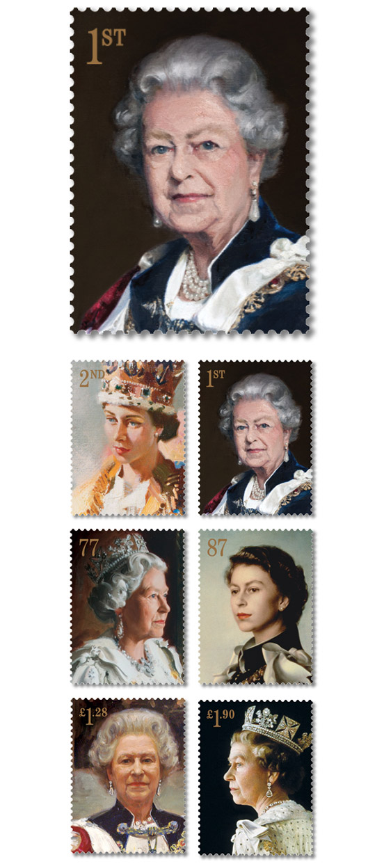
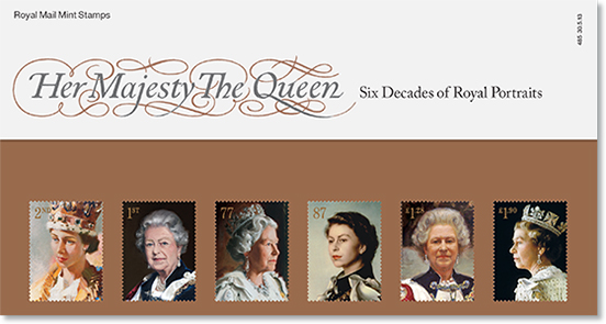
The first candidate was Terence Cuneo's official coronation portrait of 1953. It is a wonderful painterly depiction of a very young queen, carefully balancing her weighty 2.2kg St Edward's Crown. Next came Pietro Annigoni's iconic portrait — originally considered 'conventional' when it was unveiled in 1955, but by 1960 the public had warmed to it, nominating it as the 'nation's favourite royal portrait' in a Radio Times national survey. After abandoning any notion of chronological placing, the next great portrait was Richard Stone's very dignified profile of 1992. This was reminiscent of Arnold Machin's bas-reliefs used on other Royal Mail stamps. Andrew Festing's 1999 portrait was, by contrast, a lighter, almost three-quarter view, while Sergei Pavlenko's 2000 painting — the last to be selected — presented a friendly, direct, full-face portrait.
Atelier's first designs sailed through the usual committee approval process, but the main anxiety for us was the issue of royal approval. Would the Queen agree with our selection. Protocol dictates that the Queen usually refrains from commenting on her portraits, so we had no idea what likeness she personally favoured or (more worryingly) disliked. True to form, the response from the Palace when it came only stated only that the stamps had been 'approved'.
So we had consent for five of the six stamps. But what of the sixth? The Queen agreed to sit for this — a new royal portrait was to be commissioned by the Royal Mail. The incomplete five-stamp set helped as a guide in selecting a new portrait artist. After preparing a shortlist, the painter Nicky Philipps was eventually approached and then approved by the Palace.
Working on the design of this set was a quite unusual arrangement. Atelier (and the Royal Mail) did not know what the new portrait and the sixth stamp would look like until the very last minute. Nevertheless, when we got a sneak preview of Philipps' portrait it seemed to sit comfortably within the stamp set, complementing the Annigoni and Pavlenko portraits of the Queen dressed in her familiar royal robes.
In the past, portrait painting has concentrated on the rich and the powerful. However, we came to realise that the paintings in our set did not only reflect affluence and status. Rather, the stamps show the Queen as a dignified and steadfast individual. Six decades of royal portraiture have, on the whole, been good to Her Majesty.
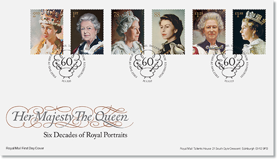
Stamp format/size: portrait 27mm x 37mm. Print process: gravure. Perforation: 14 × 14. Phosphor: all over, except 2nd class: single bar. Gum: PVA. Number of stamps: six.
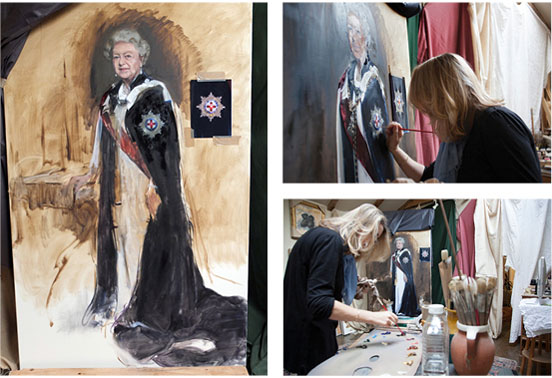
These photographs show Nicky Philipps working in her studio on the new portrait. The artist had only three hour-long sittings with the Queen, during which she strove to capture the head and shoulders of her important subject. Luckily for Atelier, we were able to work from this partially completed canvas and have the final stamp on sale at the same time that the painting was finished and unveiled to the public.
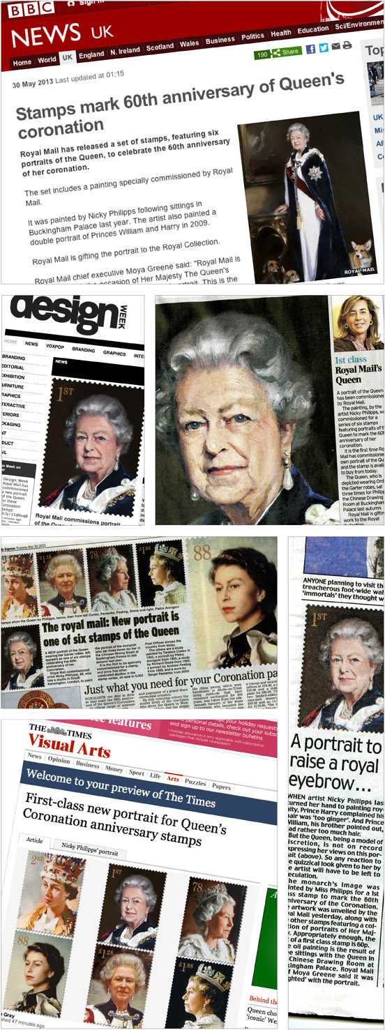
The new portrait and the commemorative stamps were seized upon by the media. It seems that even after more than 130 royal portraits, unveiling another is still quite a significant event.
Related blog: Frederick Marns