THINKING ABOUT DESIGN
Association of Art Historians
As part of a concerted campaign to restore the study Art History to the nation's schools, the Association of Art Historians (AAH) undertook to produce something practical that would make teaching the subject easier and more reliably sound: a textbook for A-level Art History.
We have a long-term relationship with the AAH, having designed their journal.
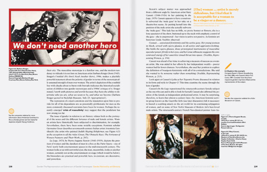
This publication had a different audience, teenagers as opposed to hardened historians. The text is produced differently too, instead of a single coherent prose essay, this text is broken into parts, with interlaced contextualising sub-essays, teaching tasks, references to external sources, checklists, all the devices necessary to create a learning experience for a teenager first engaging with such complexity.
You need the design to walk a line between calm coherence, and busy richness. Calm for focused reading, and rich to entertain and distract (but distract to another complementary source).
Rating on the website Good Reads.

Here is publisher Wiley's description:
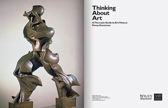
Thinking about Art explores some of the greatest works of art and architecture in the world through the prism of themes, instead of chronology, to offer intriguing juxtapositions of art and history.
The book ranges across time and topics, from the Parthenon to the present day and from patronage to ethnicity, to reveal art history in new and varied lights.
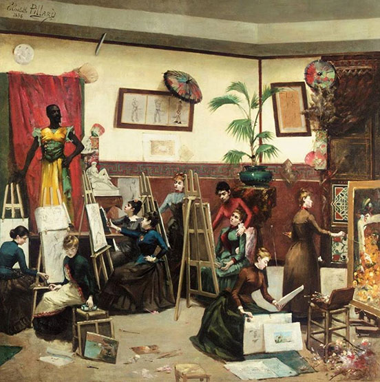
With over 200 colour illustrations and a wealth of formal and contextual analysis, Thinking about Art is a companion guide for art lovers, students and the general reader, and is also the first A-level Art History textbook, written by a skilled and experienced teacher of art history, Penny Huntsman.
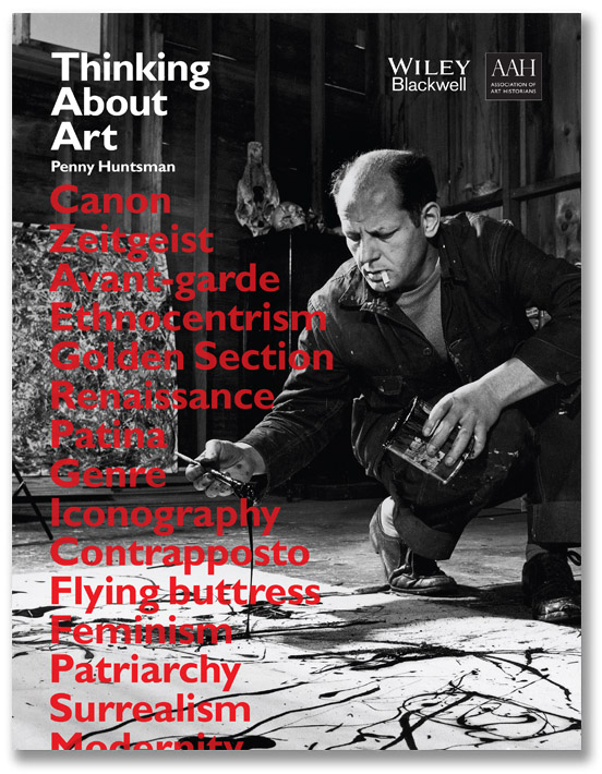
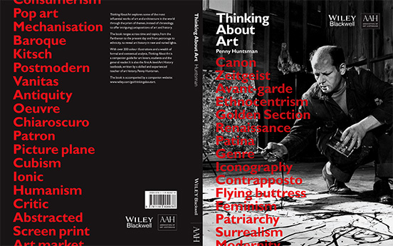
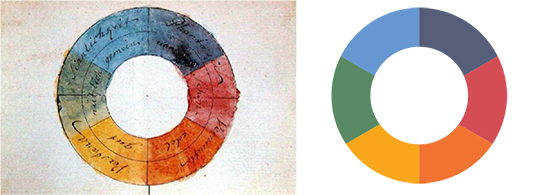
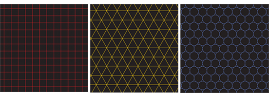
The colour scheme for the book is derived from Johann Wolgang von Goethe's theories about colour, attributing psychological effects to specific colours, such as red evoking nobility and green stimulating practicality.
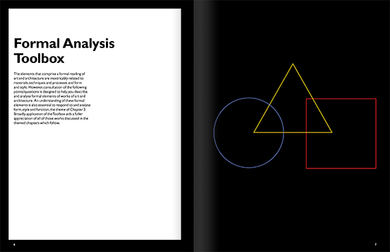
The tools section uses Wassily Kandinsky's famous Bauhaus questionnaire, asking respondents to associate colours to three primary shapes - a triangle, a circle, and a square. Kandinsky believed such elemental shapes formed the basis of all visual forms, like atoms form all matter.
At the foot of each spread is a 'progress bar', chopped into chapters and sections, that shows you where you are, in the chapter colour, as both a mnemonic and a reward for patience.