SECRET INGREDIENTS
Yattendon Estates
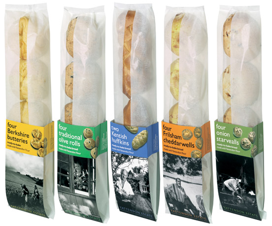
A large farming estate with a real, thriving village — Yattendon decided to start producing its own range of traditional breads. We designed the brand and the packs in collaboration with product specialists Factory Design.
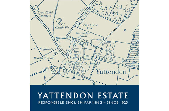
The logo and stationery literally 'locate' Yattendon as a real place, rather than a marketing invention. It even has a Post Office and a butcher! Our supporting line 'Responsible English Farming — since 1925' implies real credentials and reassurance. This was enhanced using evocative typography and traditional colours in the bread packs themselves, creating the feel of freshly-wrapped bread from the local bakery — the large pictures feature real characters who work in the village, relating stories about their lives.
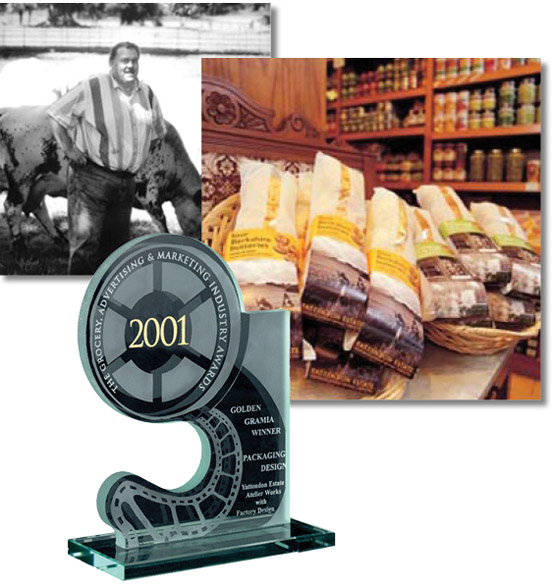
Our design won a Golden Grammia award for packaging excellence.