THE BIG ASK
Arsenal Football Club
In 2001, we were asked, along with one or two other agencies, for a discreet conversation with two Arsenal board members about creating a new crest for Arsenal.
This post, from the club's site, explains the evolution of the crest from the club's founding, and hints at the motivation in 2001, for the change: "uncertainty surrounding its exact origination". The club had recently lost a case against a trader selling shirts outside the ground, in which the judge found that the crests on the trader's shirts were "solely badges of allegiance, they were not used as trade marks". The club simply couldn't show that the crest belonged wholly and solely to them.
The report of the trial explains exactly why the club wanted a new design, that they could own the copyright for, demonstrate provenance, and register as a trademark in a number of classes and territories.
What follows is the content of our pitch, a kind of illustrated line of thinking.
The two board members ultimately picked the designers of the shop. Whose work you will be a better judge than I, (I am hardly a dispassionate observer). The Telegraph is not a fan. Nor are the fans apparently.
 We redrew Prince Philip's monogram for use on his Designers' Prize materials.
 We drew a special version of the Royal crest for use by the Museums & Galleries Commission.
 We have just redesigned the crest, and all the materials, for the Royal Institute of British Architects.
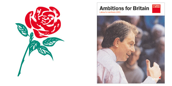 Another of our clients is the Labour Party, we designed the manifesto for last week's election.
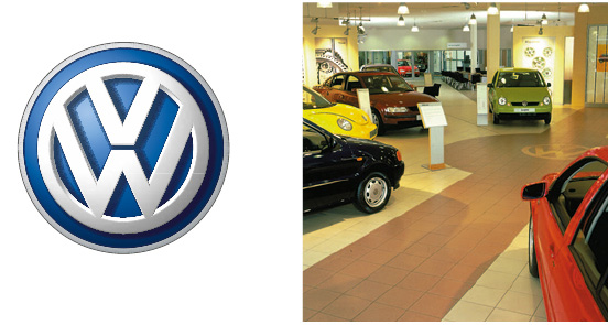 Our experience in branding is extensive, we manage all the Volkswagen dealerships in the UK, and we work for Orange, Grant Thornton - one of the world's biggest accountancy firms - and the Design Council.
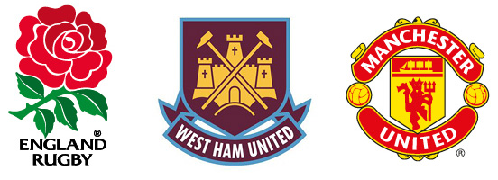 All sports clubs are refining and clarifying their identities. This is a selection of newly drawn badges.
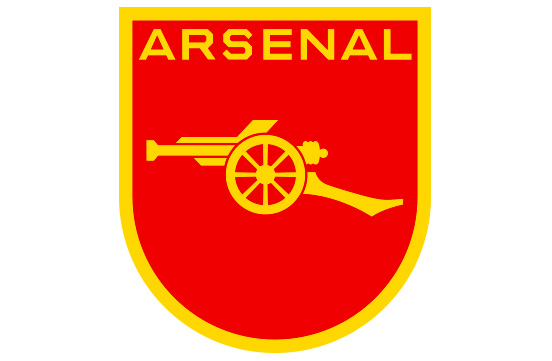
 Arsenal need to produce a badge that can be copyright protected, and show 'point of origin'.
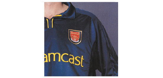 The use of the elaborate coat-of-arms causes some manufacturing and some visual problems. To make a cloth badge the coat-of-arms has to be put on a background, and then stitched on with a thick row of thread making it even more complex. At this size it has no visual features that stand out clearly.
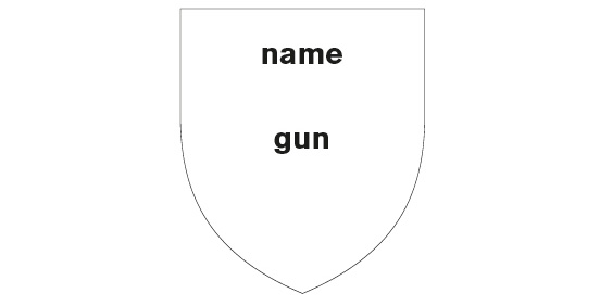 The brief asks for a crest with two elements which can be lifted out; the name Arsenal, and the gun.
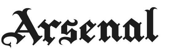 The gothic script is very distinctive - it was popular in the period of Arsenal's founding in the late 1800s. It is very hard to read when it is small, or when a player wearing it is moving.
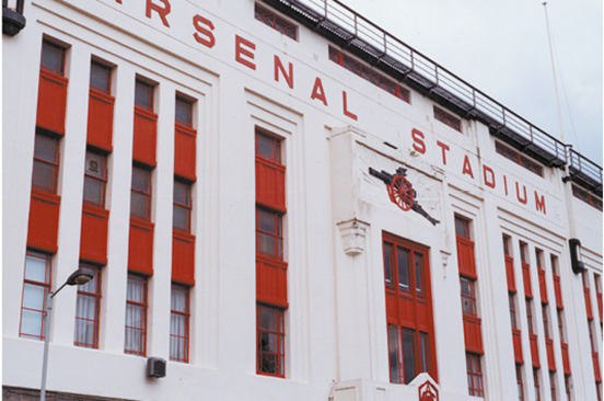 The much-loved Highbury provides a possible solution, it has highly distinctive angular tile letters.
 This lettering uses the letters from the stadium. It is drawn from Arsenal's history, and is unique and copyright protectable. It also performs well in legibility tests.
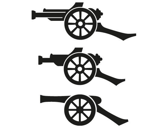 We have experimented with slight changes to the shape and length of the barrel and trail. Some go too far in simplification.
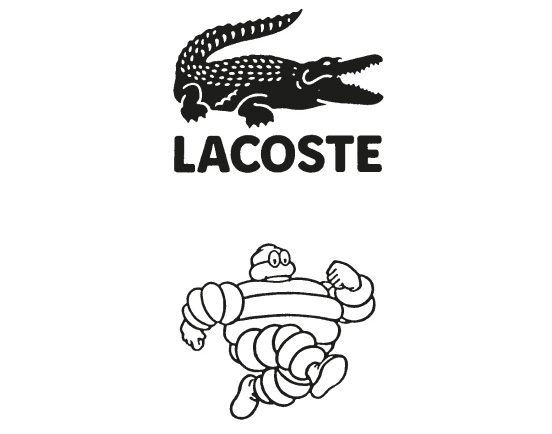 Some picture logos need to retain complexity in the way that they are drawn in order to stay recognizable.
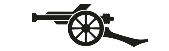 At this point, we think this version of the gun is the best combination of crispness and character
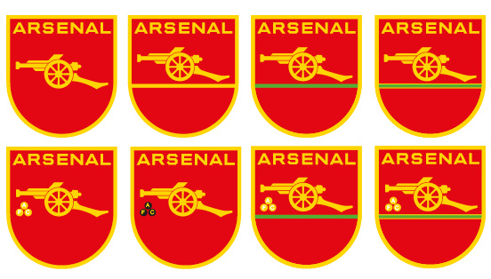 We have experimented with combinations of different types of lettering and gun to find the most characterful and visually strongest.
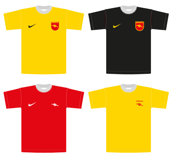 We have experimented with using the new identity elements in the context they will need to work; with other logos and colours.
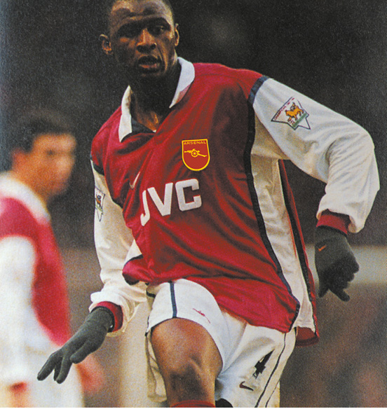 Branding works by repetition. Rather than the over-elaborate coat-of-arms, the new crest will work to reinforce Arsenal's brand so much more strongly through television and photography of the players.