RSA REDRAW
RSA
The Royal Society for the encouragement of Arts, Manufactures and Commerce is more commonly known as the RSA. Its mission, according to its 1754 founding charter, was to 'embolden enterprise, enlarge science, refine art, improve our manufacturers and extend our commerce'. Today, the RSA is 'an enlightenment organisation committed to finding innovative practical solutions to today's social challenges'. The words may be different but the intention is the same; it is an organisation that seeks to improve society on all fronts.
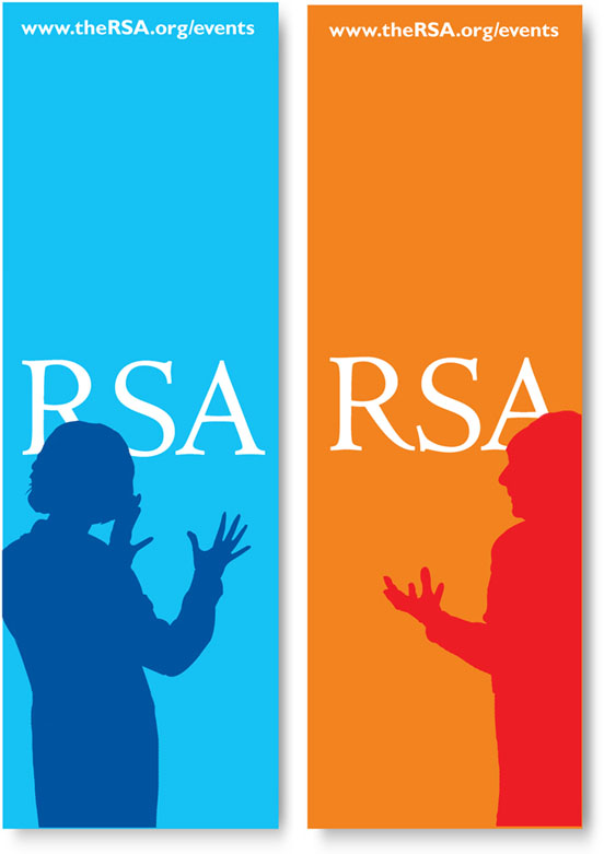
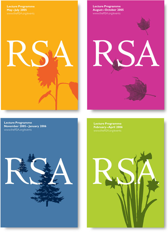
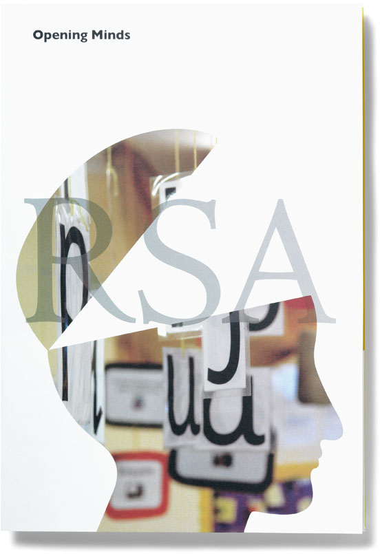
'Improvement on all fronts' could also apply to the RSA's own public front. For many years, the Society has launched important social projects and run them until they became self-sustaining, at which point the Society champions another cause with a fresh programme. This continual cycle of launching, nurturing, and casting off projects meant that the RSA logo was used mainly in an endorsement role. Often small, hidden in a corner or pushed to a margin, it rarely seemed to hold its own ground.
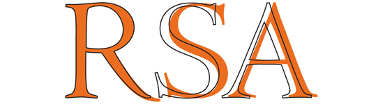
Conscious of its own brand being in the shade, the RSA asked Atelier to review the Society's logo and its use. We looked closely at the letterforms and identified it to be an exact letterpress reproduction. When used on a bigger scale, large gaps appeared between the letters because of the trailing leg of the 'R'. We addressed this with a subtle redrawing of the letter 'R'.
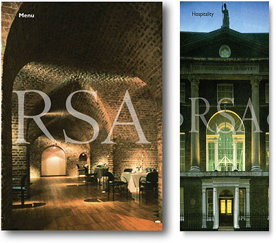
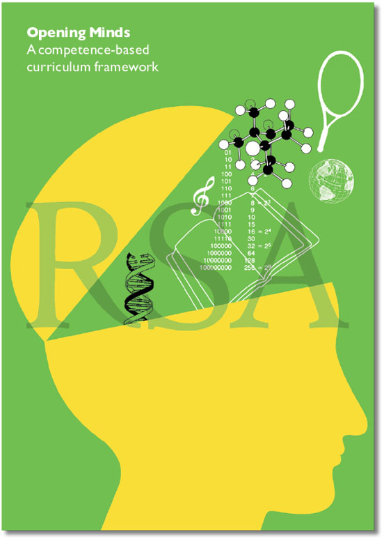
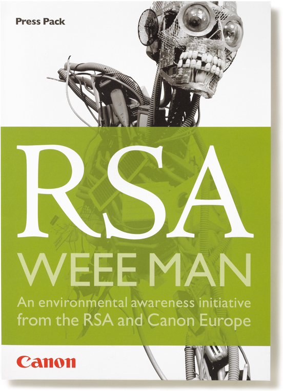
Bringing the brand to the fore was straightforward; this could be large and centred on a front cover if it was applied as a tint, or integrated as part of the design.
A brand refinement doesn't have to be complex. Design is often the application of some logical thinking when you are searching for 'innovative practical solutions'.
Related projects: WEEE Man, Opening Minds