SURF'S UP
Orange
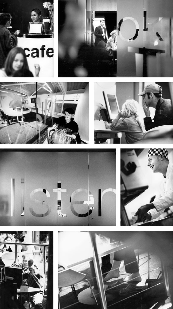
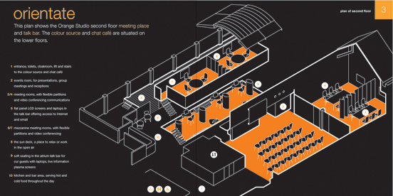
How 'Orange' is a cup of coffee? This was one of the first questions we were asked to ponder as we began The Orange Studio project, a pilot which was to become a showcase for Orange's sophisticated use of technology. The Orange Studio was a multi-level, multi-functional space centred around users and wireless technology including a café, shop, meeting and training rooms and a bar — kind of Regus meets Starbucks via the Apple store.
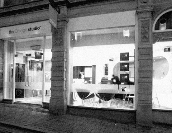
Our brief was to position, brand and communicate these complex offers whilst remaining firmly 'on brand' — something which Orange valued above everything (quite rightly). All within a tight 6 month timeframe as the building was being fitted out.
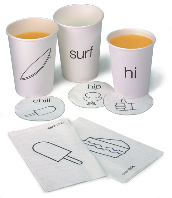
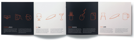
The language of icons we developed was designed to be incredibly flexible within the Orange brand identity. It allowed us to communicate everything from delicious coffee & mail shots to screenings of the classic silent film 'Ben Hur'
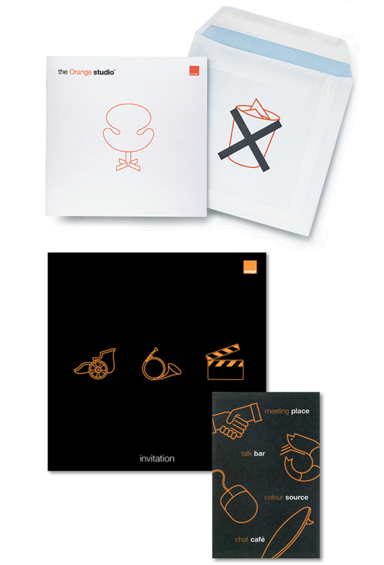
The solution was centred on our core proposition, 'Choose the way you want to communicate'. Visually, this was supported by a language of Orange Studio icons which, applied with The Orange brand colours, extended to marketing, advertising, web and building graphics — even the coffee cups looked 'Orange'.
The project was awarded one of the best identities of the year by D&AD, our professional body.