GLOBAL UPTAKE
Grant Thornton LLP
Grant Thornton is the sixth-largest accountancy network in the world. It differs from the other 'big five' in that it is the only network that is focussed on independently owned businesses. It claims to be 'on the front doorstep of every business, everywhere in the world', and is obviously very good at understanding the needs of SMEs, with many clients having been loyal for more than twenty years.
When Grant Thornton took the important step to build a new global brand identity, the intention was to unify an expanding network. The design challenge was not to create a new logo (a terrible brochure with a great logo is still a terrible brochure); instead, we looked at the root of the identity problem.
After careful analysis, we discovered that all accountancy firms use the same clichéd representations of their services; stacks of paper money from around the world, piles of coins, flags, globes, and an awful lot of those 'power handshakes' that clinch fictional deals. In an experiment, we amassed competitor material, covered over the logos, and found that with such similar imagery it was difficult to distinguish one from another.
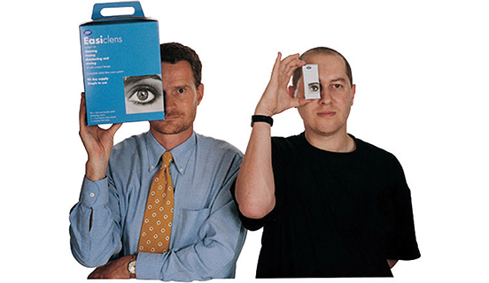
We went off to speak with some Grant Thornton clients. After candid exchanges, we were left with an encouraging indication of a design route to pursue. All of these clients spoke warmly about their local account managers, what they had done for them, and were genuinely reliant on such a personal service. Our recommendation to Grant Thornton was simple; just let the clients do the talking and reflect that doorstep presence around the world. What better way to side-step the clichéd imagery and show real success for real clients?
So that's why those two fellas above are looking at you now. They run a very successful packaging design company and have been with Grant Thornton for more than ten years. We used this image to launch the principles of Grant Thornton's new brand identity — without putting pen to paper to create a new logo.
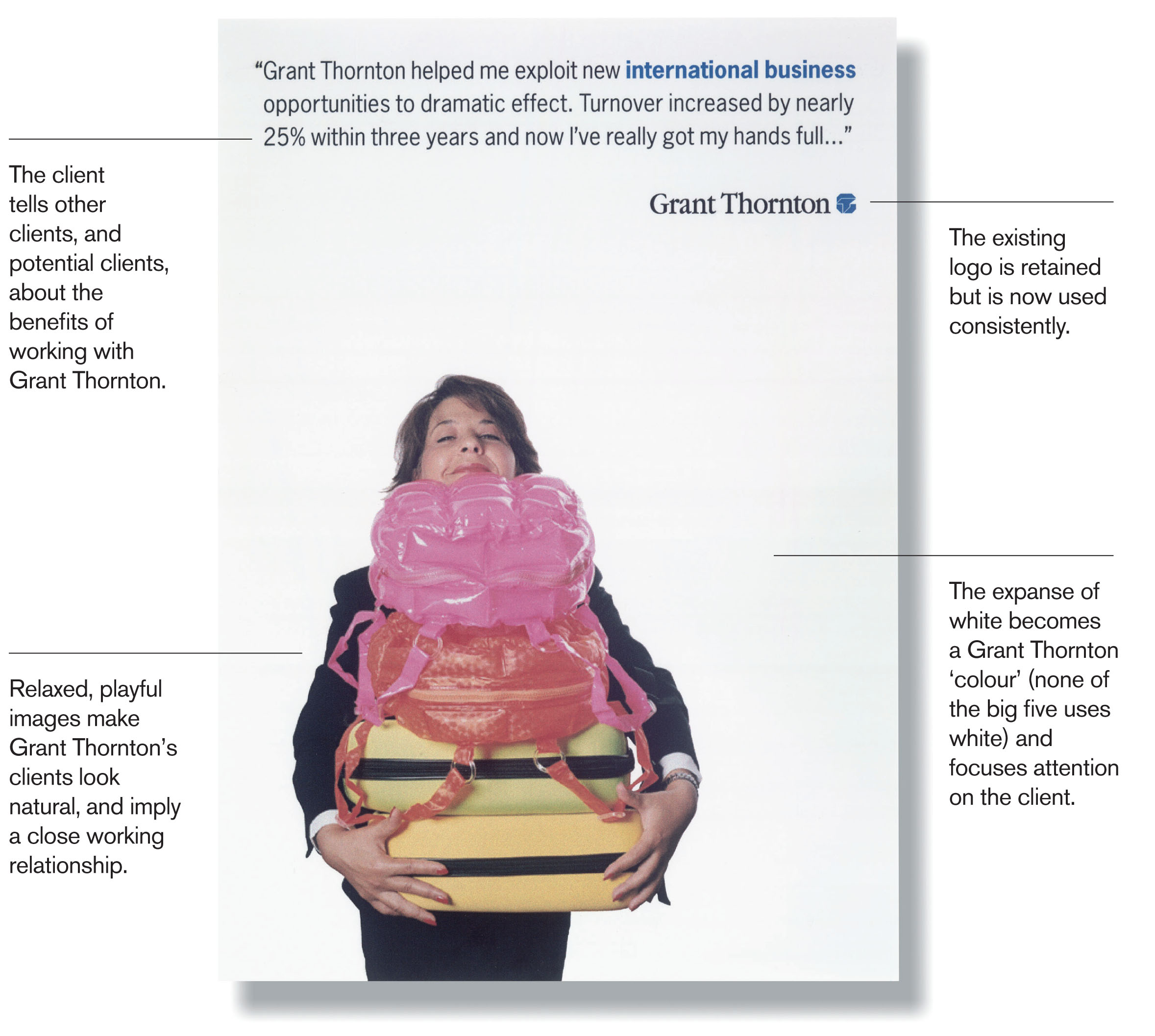
Here are the basic principles of their new brand identity. It is disarmingly simple, easy to understand, and most importantly, it encourages Grant Thornton partners to seek out new clients to represent them all around the world. Every Grant Thornton partner office in the network suddenly had the chance to participate in the launch of the new brand identity and to trumpet its own success stories. This Atelier design proposal had instant uptake in more than 100 countries.
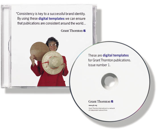
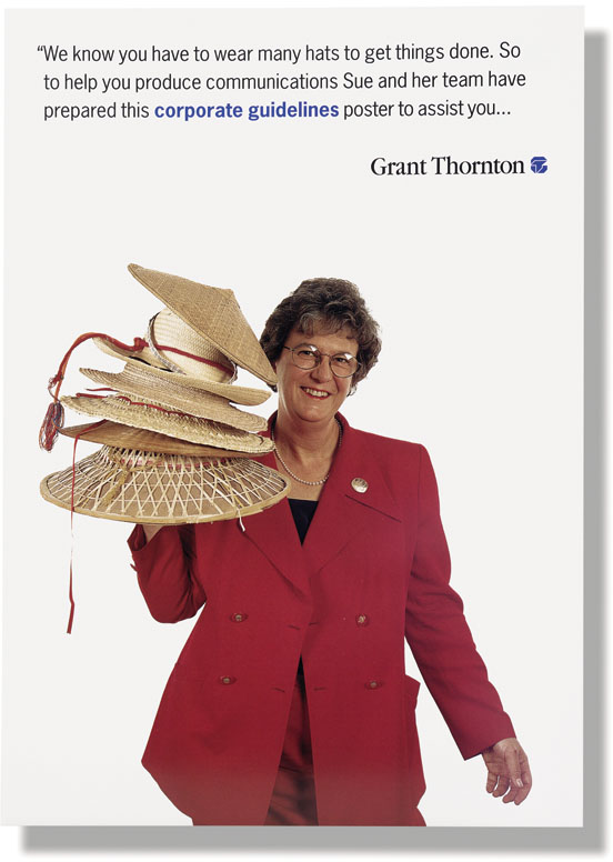
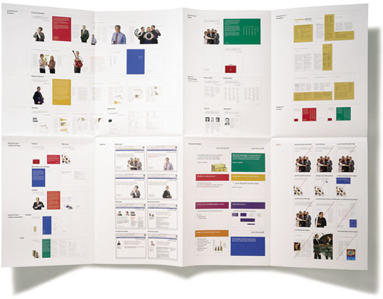
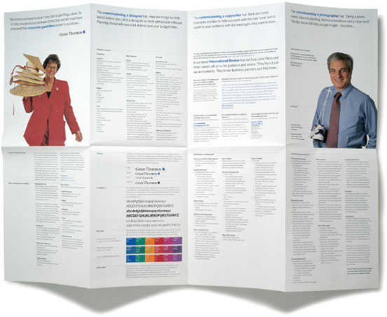
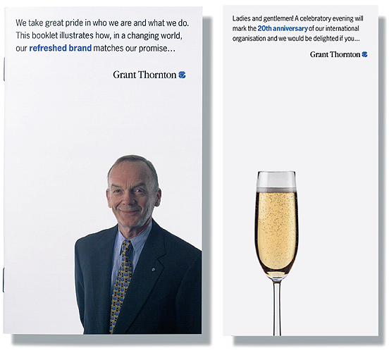
The new identity was launched at an international conference in Boston, USA. As part of our presentation to senior partners we produced three important launch tools. A booklet (below, left) went out to all 25,000 staff members, explaining the branding project and placing it in the context of Grant Thornton's strategic ambitions. A fold-out poster (above) was sent out to all Grant Thornton marketing staff, providing them with exemplary briefs for photographers and copywriters. This easy-to-grasp poster took staff through the stages of commissioning and producing communications in the new style. Lastly, all production templates, brand assets, and specifications were included in a guideline CD that marketing staff could distribute to their external creative teams.
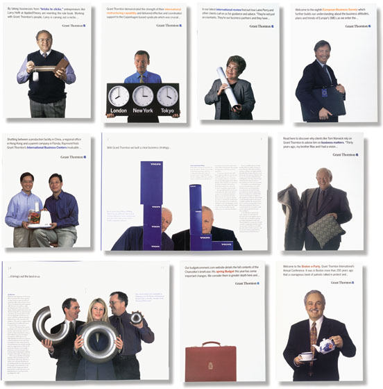
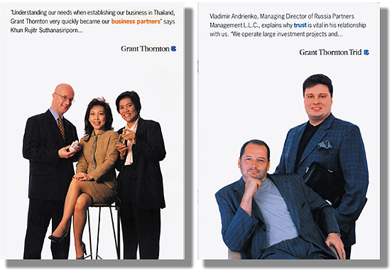
From South-east Asia to northern Eurasia, each network office began to produce its own communications and proudly introduce its clients to the rest of the world.
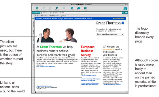
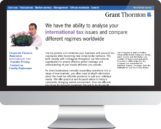
When it came to developing online guidelines, we followed the same simple design principles that worked so well in print.

 Hugh Pearman, design and architecture critic for the 'Sunday Times'
Related project: Financial Transparency