EPAY
Euronet Worldwide
Back in 2009, the parent company Euronet Worldwide had six different operating names. In the UK, it was the unknown technology provider and cash collection service behind many high street card payments and ATM transactions. Euronet's prepaid mobile top-up services were becoming an important sector of new business and the company had just won the contract to service London's congestion charging. Looking ahead, it needed a public face if business was to continue to grow.
Atelier was initially asked to consider the naming and review Euronet's current brand hierarchy. What would work for the UK consumer while helping to rationalise its existing worldwide operating structure? Given a short timescale for a UK launch and the cost impact of a worldwide implementation, we recommended the development of a new mark that would be relevant to all operating areas and could be implemented without changing well established regional names.

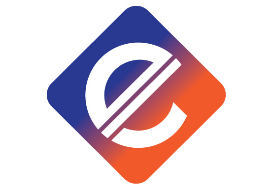
During our design research stage we realised that, while countries have various currencies, many of the most important monetary symbols have one thing in common — they all have 'double line crossings'. It is a prominent feature of the dollar, the pound, the yen, and the euro.
Walk along any major city high street and you will be assailed by a barrage of signs and symbols. The new mark would have to fight its corner in an uncontrolled environment. Our answer was to develop a mark that was distinctly different from any other; it would be diamond-shaped and use unusual colour combinations, but it would inspire the confidence of a monetary symbol with the familiar 'double line crossings'.
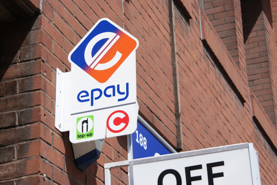
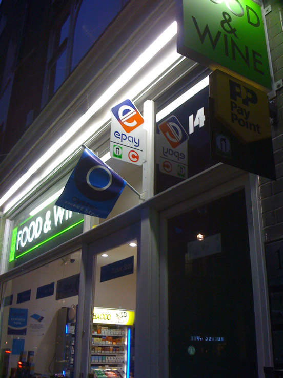
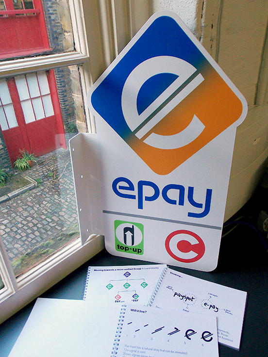
Today, epay is one of the UK's leading electronic payment providers, the service behind card payment transactions at more than 150,000 points of sale. On the high street, these transaction points are now easy to spot and epay has finally come out from behind the counter.