DOUBLE LONDON
London Design Festival poster
The text below in italic is on a site selling my poster, it perfectly describes project:
London Design Festival presents The London Poster Project.
Presented as part of the London Design Festival at the V&A in September 2009, this limited series of 20 posters, designed by some of the country's most renowned graphic designers and typographers, aimed to celebrate an essential aspect of design talent in London.
The brief was kept as open as possible - with a simple direct theme of 'London' - the designers were challenged to express their own thoughts on our city. The only restriction was colour: The designs could only use black and red. London is an amazing city, exciting,diverse, beautiful, dramatic, challenging and intriguing; each of the designers made a personal statement, ensuring that a variety of ideas came through.
Sometimes it is wonderful having a loose brief, being asked to reach into the box room of your imagination, and pluck out something surprising. Other times, it is a curse. A free-floating, anything goes curse. However much designers complain about restrictions, it is constraints that provoke and channel creativity. Like grit provokes a pearl. Necessity is the mother of great graphic design.
How to capture London, in all its copiousness. Peter Ackroyd, in his biography of the city, calls London "infinite". Undefinable by any one thing. For the design of a poster, posters live by expressing some very compressed and singular idea, this is a gargantuan challenge.
This is sort of how my thought process went:
Searching for a way to convey something unique to London. Using minimum means. Start with the word London, and then do what to it, add what? Use the London typeface, Edward Johnston's 1916 humanist sans serif for the Underground Electric Railway, now used everywhere. Is the color red enough? Very cool, just the typeface and a colour. Pillar boxes and guardsmen's jackets. And buses. Buses. Double-decker buses. Can the name London be made into a bus? How, the wheels, two "o"s...
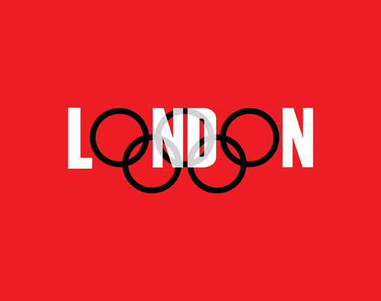
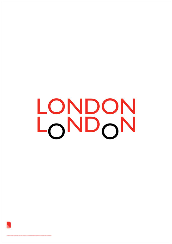 The final poster
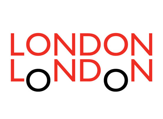
 How the poster should have looked (two versions redesigned in retrospect)
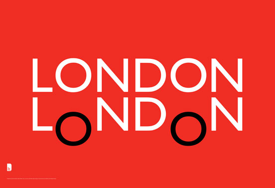
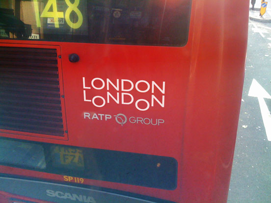
 An idea by David Brownjohn, after gazing at my poster
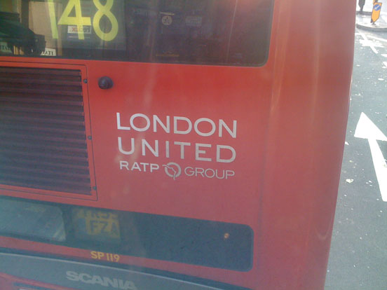
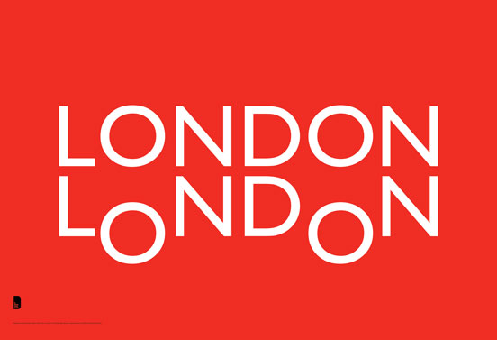
 The perfect logo for London's buses?
Quentin Newark
(Looking forward to royalties Mr Online Editions.)