COME TO THE EDGE
Falmouth University
When we won the pitch to rebrand University College Falmouth, we were told our presentation thinking was 'head and shoulders' above the competition. A fitting compliment from an organisation whose strategic ambition is to become a global top 5 specialist multi-arts institution by 2017.
![]()
Process
The starting point and key to unlocking the value of the brand, was to establish the right name and research an authentic brand story. Through a comprehensive process of consultation and discussion, running workshops and conducting email and telephone q&a sessions, we asked some key questions:
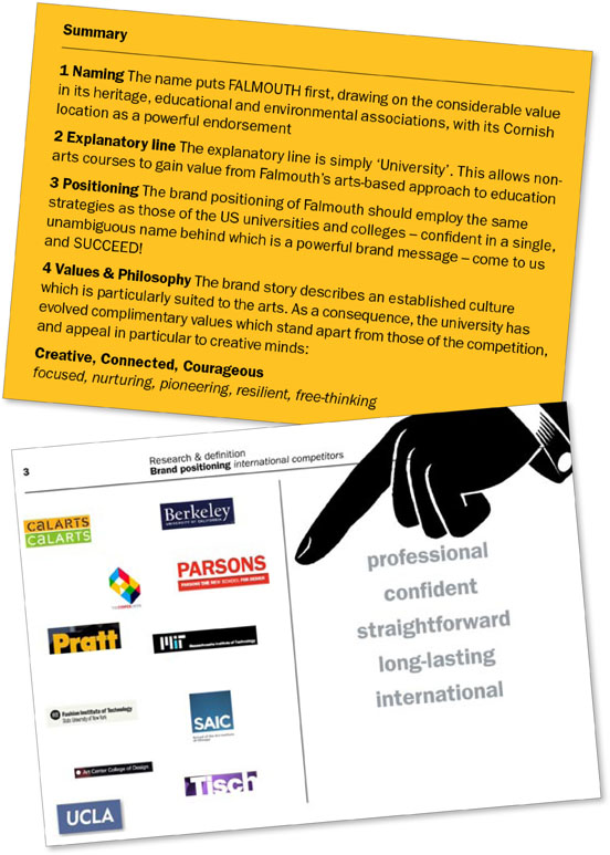
1 What should the new University be called?
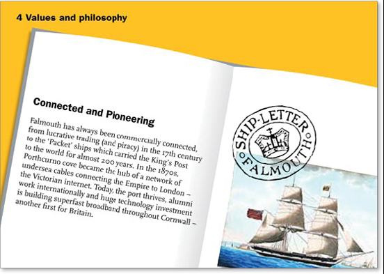
2 What is so special about studying and living in Falmouth?
3 What are the inward and outward perceptions of Falmouth?
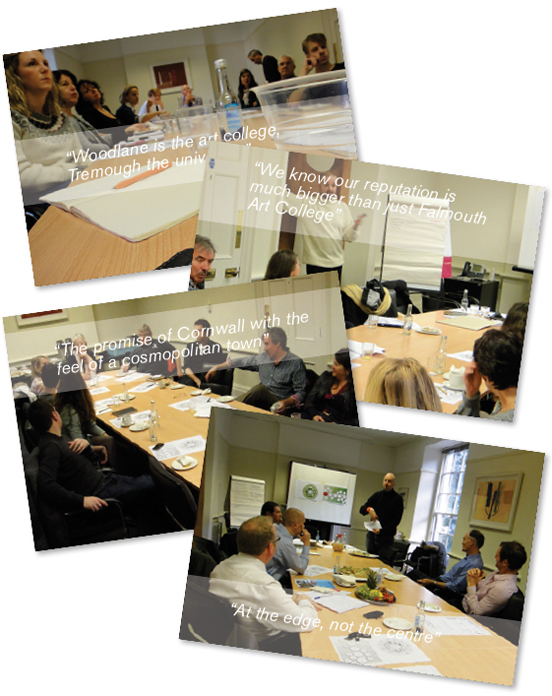
What they told us was not only very revealing, but amazingly there was concensus, from local businesses to development bodies and the students themselves:
The Brief
A parallel study in the form of an audit was made of competitor institutions, covering the local, regional and national universities all the way to global institutions such as Yale and MIT. We established that the culture and ambition of Falmouth as a university implied the brand positioning of the US institutions, all highly aspirational brands. Working closely with the steering group, our recommendations effectively became the creative brief upon which the brand would be developed.
![]()
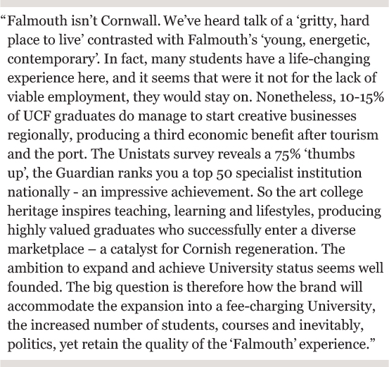
Brand Story
The workshop intelligence, combined with our own research established a powerful brand story which underpins the culture at Falmouth and sets it part from its competitors. This is the reason that Falmouth has been such an inspiration for artists and entrepreneurs over the centuries, and forms an important part of the university's core values and ultimately, the unique educational offer- Falmouth alumni have succeeded in all forms of arts and media, and include Tacita Dean, George Passmore (Gilbert & George), Paul McGowan, Luisa Baldini, Fergus Walsh and Gerard Woodward.
Brand Values
Our research into Falmouth's brand story revealed a unique environment which is particularly suited to unconventional thinking. Falmouth has embedded values which stand out from the crowd; the place encourages creative thinking at multiple levels. The headline brand values are global - bold and statemental:
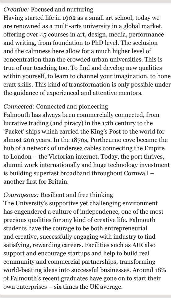
• Creative, Connected and Courageous in bold?
The supporting brand values are more personal - an insight into individual experience:
• focused
• nurturing
• pioneering
• resilient
• free-thinking
![]()
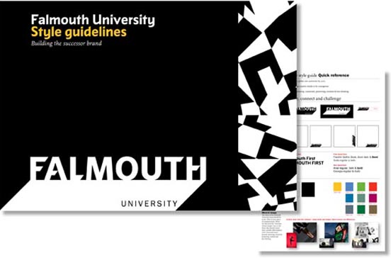
The logotype
With the name, the brand story and values in place, the design of the logo had to express Falmouth's creative 'edge' both in locational and cultural terms. Our design was deliberately positioned to sit amongst the global top 10 - confident and simple rather than parochial and competitive like the regional and local universities. The concept of a 'stage' began to evolve, upon which all sorts of creative expression takes place. The backdrop is the name 'Falmouth', writ large and bold but with the character of the official stamps of the packet ships and the pennants of the boats themselves. All underpinned by comprehensive style guidelines.
![]()
The concept of a stage began to evolve, upon which all sorts of creative expression take place. The backdrop is the name 'Falmouth', writ large and bold but with the character of the official stamps of the packet ships and the pennants of the boats themselves.
![]()
The Launch
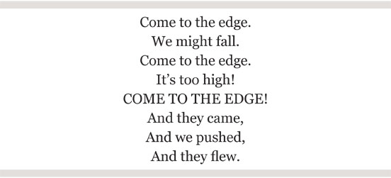
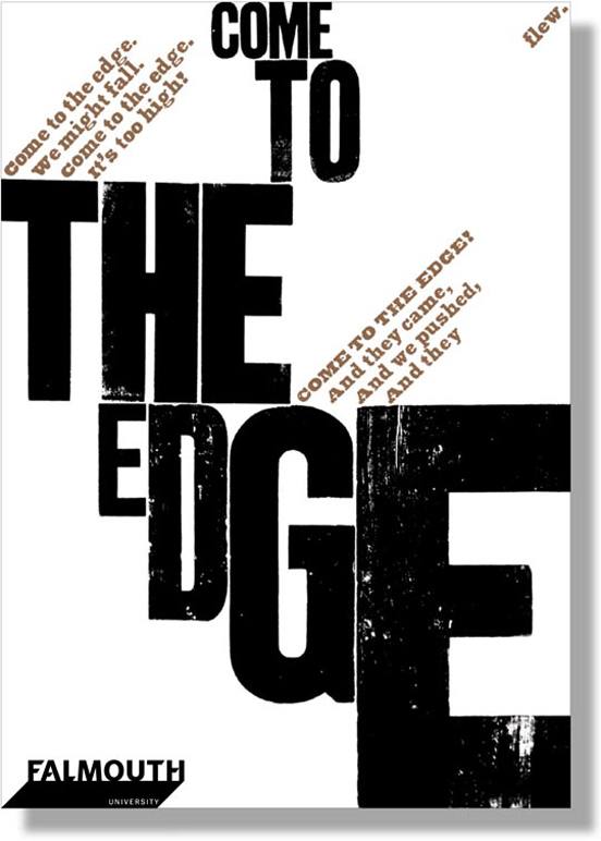
We felt strongly that the culture shift from College to University warranted a launch campaign, which introduced the new identity and expressed the essence of the brand. We were inspired by Christopher Logue's poem, 'Come to the edge', which seemed to embody many of Falmouth's core values and represent an invitation to creative minds to engage.
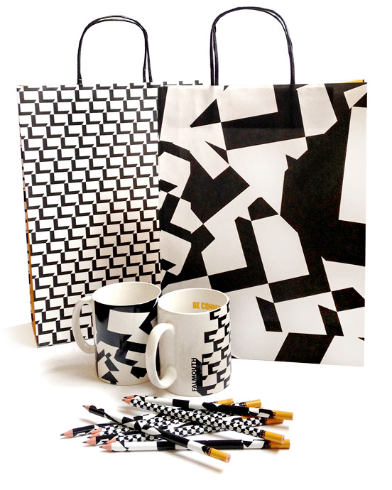
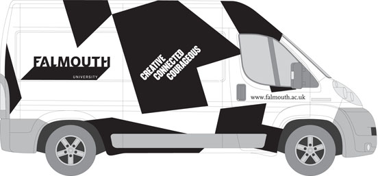
We worked with letterpress typographer Alan Kitching RDI to design a hand-printed launch poster and developed this into the animated journey around the new logo which begins this article. Promotional items were designed using dynamic patterns, derived from the logotype, which shouted out 'Creative, Connected, Courageous'. Even the University van became a dazzling advertisement.
![]()
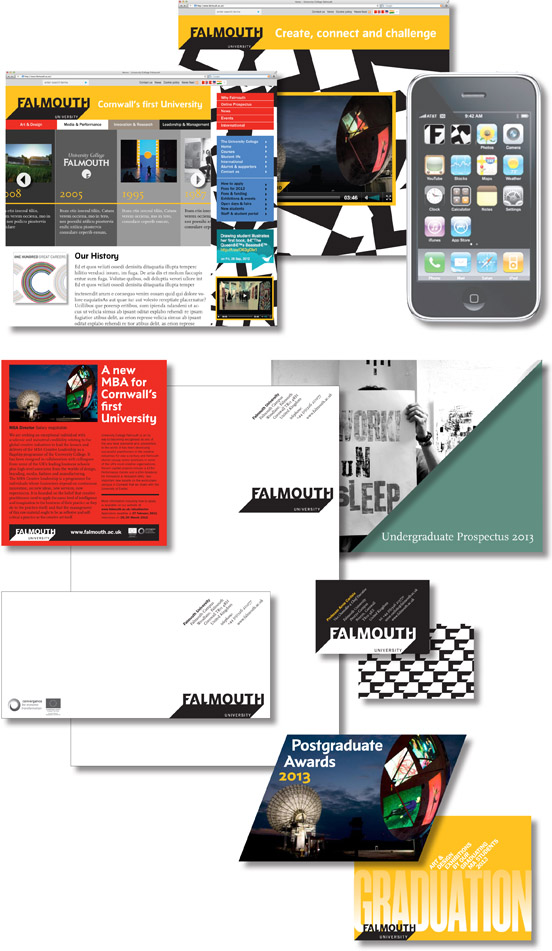
Applying the new identity
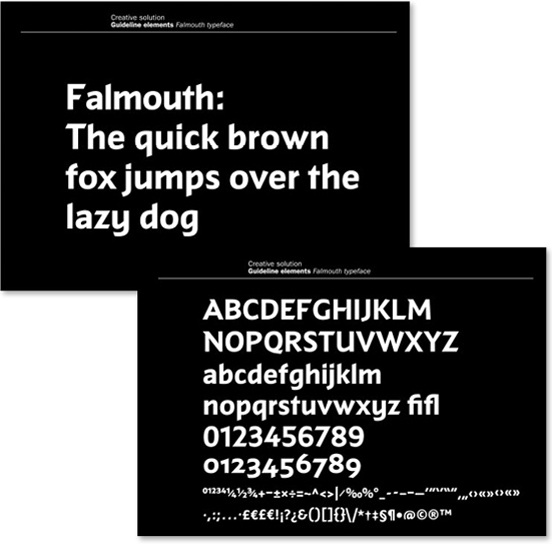
To help underpin the identity, we designed a special typeface, 'Falmouth' in collaboration with specialist designer Jeremy Tankard. Inspired by the the same influences as the logotype, the font is designed specifically for titling, asserting Falmouth's unique personality.
The original idea was always to place the mark in the bottom left hand corner, far South West, like Cornwall, which led the eye into the page (as we read left to right). This proved impractical however, particularly on websites and livery, so the position became more flexible. Captured in style guidelines, the ingredients of the brand from fonts to colours and imagery, have now begun to manifest.
Here are shown some of our examples of the new identity in application, both before and after. They demonstrate the confidence and consistency of the American aspirational brands, designed to be a dynamic, world-beating contender in creative arts education whilst retaining its unique links to an inspiring location and culture.