FIGHTING FIT
Bivonas Law
The world of Bivonas is, despite the suits, a world of seriousness, fierceness, consequences that involve millions of pounds and years in jail. The hard heartedness of the prison yard stare. Who blinks first has lost. Even writing about it makes my cowardly blood run cold.
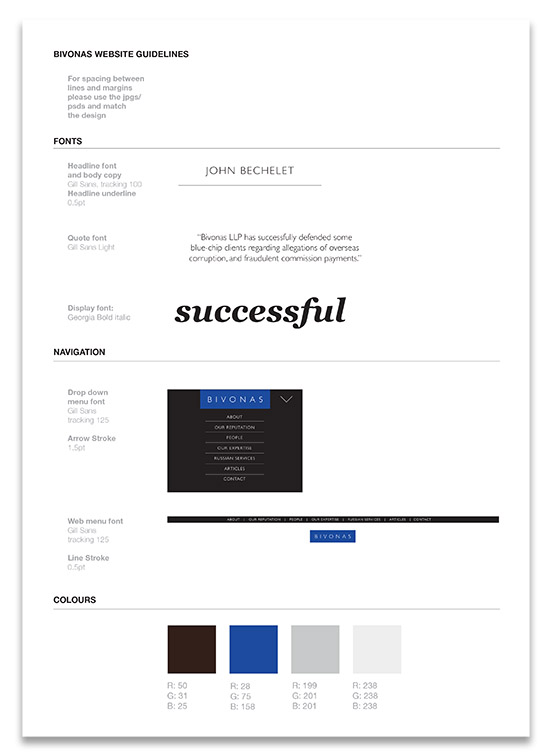
Our task in helping them communicate who they are, and how good they are, was to create their visual language. By that we mean graphic elements - logo, type, colours, imagery, and the way these things work in concert - that instantly convey an organisation of peak focus and effectiveness.
The whole design approach is of brevity, under-statement, but maximum impact. All with a certain, well... the best word is hardness.
The main manifestation has been the website: http://www.bivonaslaw.com
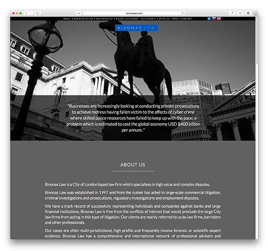
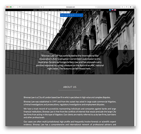
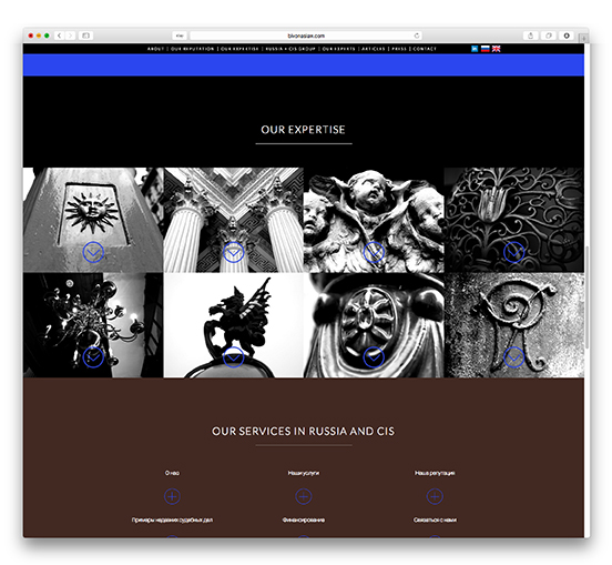
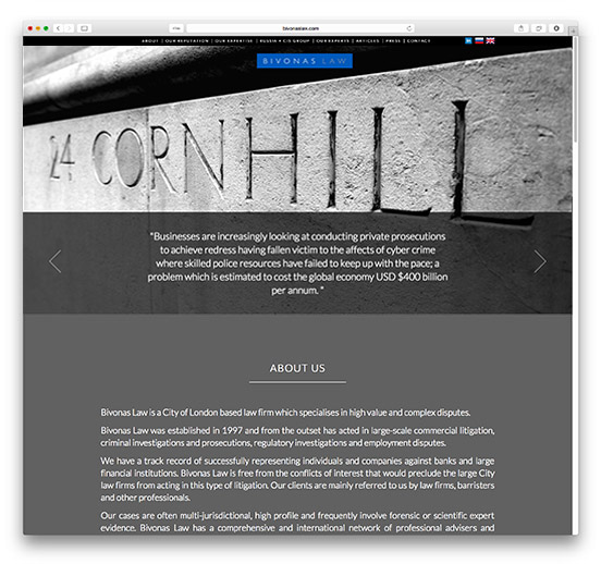 The home page establishes both permanent and fresh messages: a description of Bivonas Law and its expertise, contrasted with scrolling fresher contemporary news items.
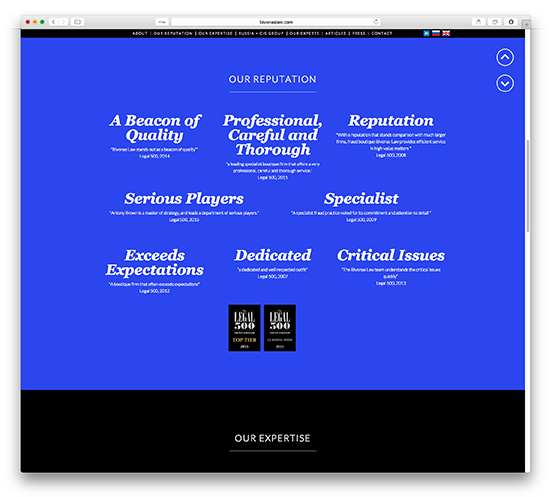
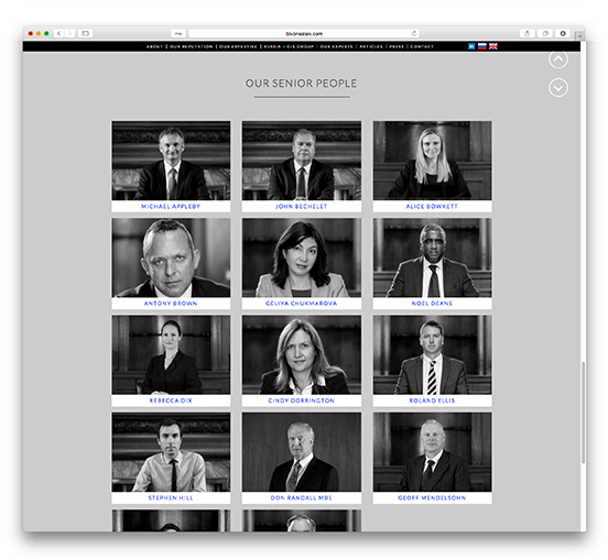
A little further down the brevity is given greater explanation with testimony, detailed services, and individual cvs.
Programming guidelines and designs showing the entire site, laptop and smartphone versions.
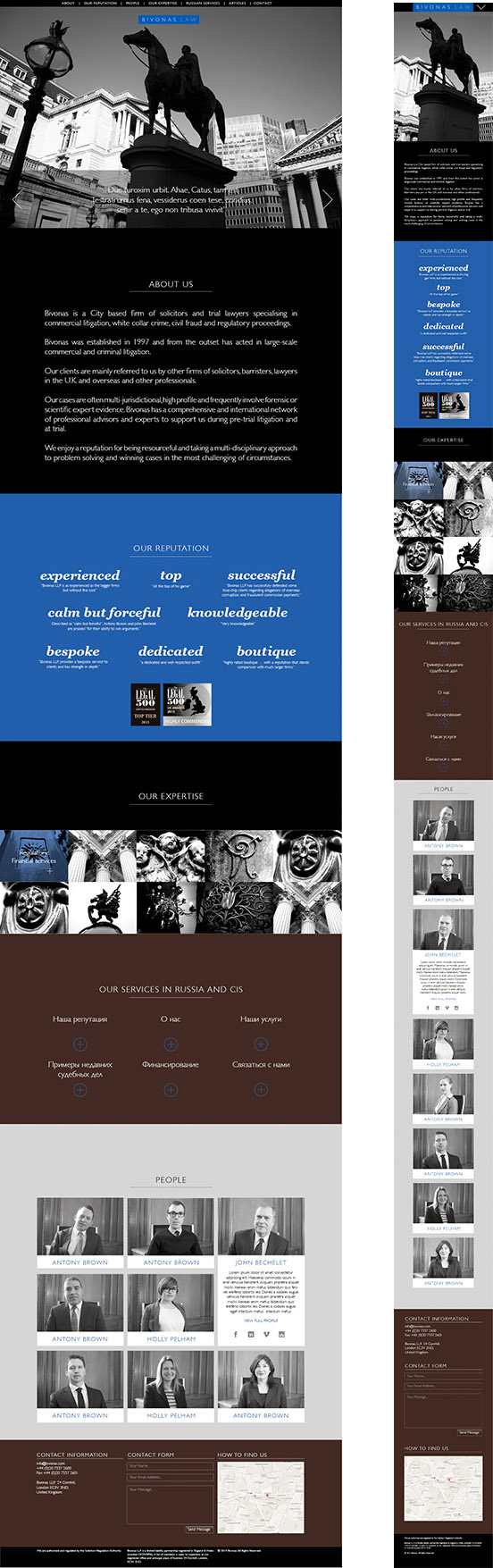
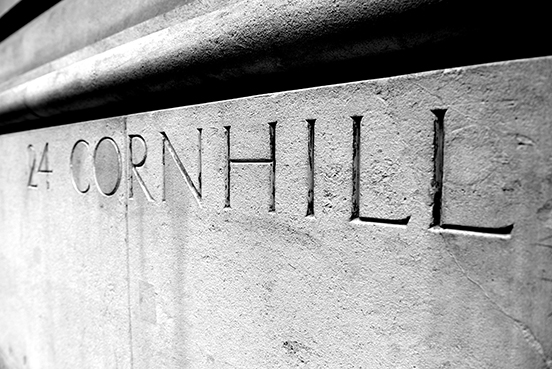
We established that the firm's location is of primary importance, they are a stone's throw from the Bank of England, in the literal epicentre of the City. The location says everything about their connectedness to the financial firms, the institutions, the legislators: the whole context of the people they defend. We illustrate this very directly, with photographs of their patch.


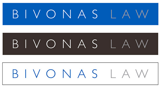
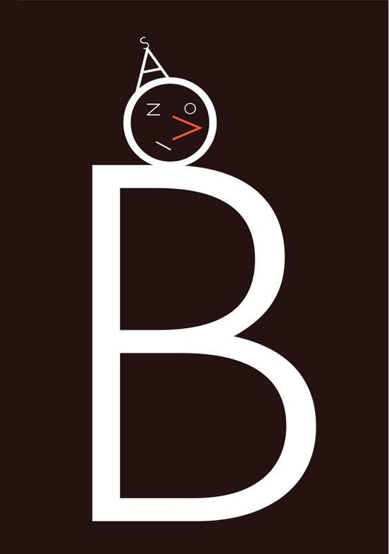
The logo has been through various iterations, finally needing its widely spaced elegant letters "beefing up" by being placed in a protective slab of colour - it changes and toughens up the logo without changing it.
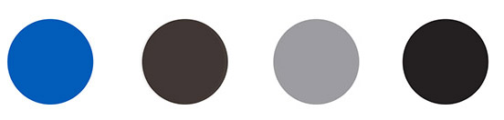
The colours aim at a balance of sombre and smart. Sombre because of the seriousness of what the clients face, but more alive colours to be smart, professional, effective... very unusual combination the blue and brown, but they become memorable because of that rarity.
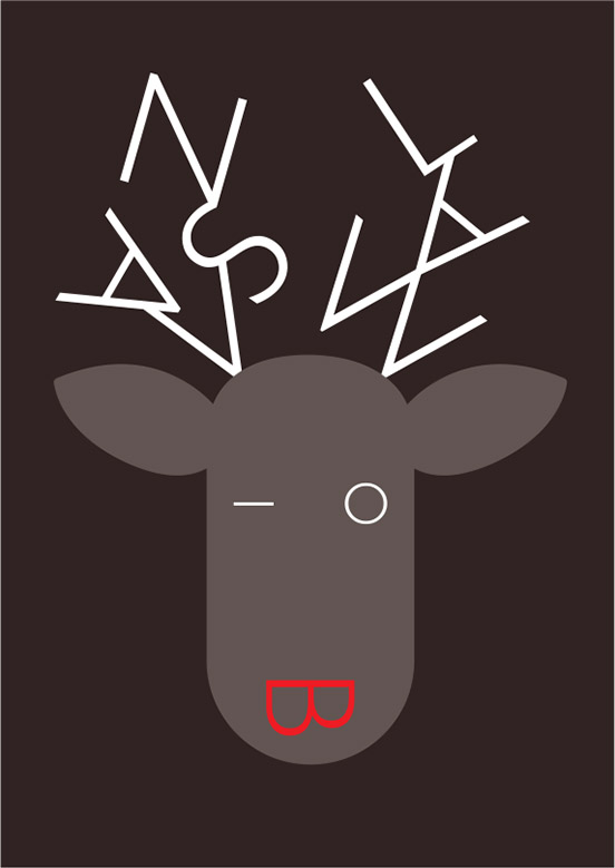
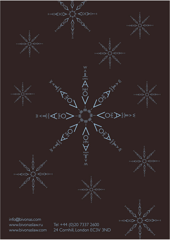
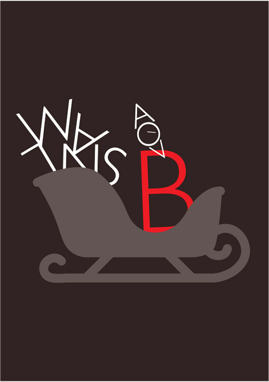
And lastly, when Christmas comes, Bivonas want to show they can be just as jolly as anyone else.