06.06.2018
EYES FOR GOAL
To accompany our pitch design for Arsenal's logo, we republish this article - about British football logos more generally - first published in the football magazine FOURFOURTWO in 2007.
British club football has become a real force in the world game, by dint of taking the best of what is available, the best players, the best managers and the best playing strategies. One part of the clubs' identities has been left outside this efficient pragmatism: the badges. The club logos languish in a naive and essentially Victorian era. They have not kept pace with the sponsor and sports-kit company logos that appear alongside them on every team's shirt.
Recent changes in design law allow new badges to be registered as designs as well as trade marks for extra protection against counterfeiters - the stalls outside every ground selling cut-price kit. Arsenal recently redesigned its badge (as of 2007) and has become the first football club to register the new design at the Patent Office. The club can now take action against counterfeit goods free of some of the limitations of trade mark law. Unlike a trade mark, to sue for design infringement, you do not have to prove the badge was used in a trade context - it is enough to prove ownership of the "property". This could mean that a surge of clubs redesign their badges for extra protection, following Arsenal's lead.
The basic design approach for football badges is faux heraldic. The designs borrow basic shapes from the mediaeval system of heraldry. Heraldry is shaped by unbreakable rules that ensure visual clarity. The system is overseen by the College of Heralds, founded in 1484, that frowns on any innovation, but football clubs gaily flout these rules and, without understanding, cram their shields full of images: animals, plants and ribbons that have little to do with the restrained incremental accumulation that meant the crests of noble families remained identifiable through the centuries.
The design of several newer badges from the last 20 years - Blackburn, Fulham, Sunderland, Southampton - are terribly mixed up. They don't really seem to know what to communicate. Instead of using experienced, professional designers, the clubs hold car-boot-style 'competitions' with the fans submitting ideas, and the board chipping in their thoughts. The results are cobbled-together collections of tradition and modernity; images that represent a bit of the old badge, the city, the shirt, the new stadium, the game of football itself. (Before anyone cries that fans are the heart and soul of every club, I answer, of course they are. But fans aren't asked to design the new stadiums, manage the accounts, or establish the teams' diets. Why are these areas treated as domains strictly for professionals, but the clubs' identities aren't?)
Many well-known international brands have logos that date back into the nineteenth century, like the first British football clubs; Levi's, Shell, Philips, Dunhill, Kodak, Goodyear are all more or less a hundred years old. Their original trade marks, or badges, were complex in a similar way to football badges, but they have adapted them to the changed visual conditions in which trade marks now need to work.
Like modern companies, every football team now has to use its badge in ways unimaginable even 20 years ago. The technical and physical demands are vastly more convoluted. Badges are now viewed in microscopic size on photographs of the players, shown in roughly printed newspapers, on flickering television and web screens, stitched into football kit, printed by every conceivable method onto huge ranges of merchandise. In these, and many other circumstances, the fussy fake heraldry does not hold up well, rendering the lettering and imagery near illegible.
Rather than lagging behind, football clubs need to catch up with their commercially astute sponsor companies. The clubs ought to have badges that work in all the applications demanded of a modern club. They ought to have badges that capture and communicate the soul of a club, but work in today's environment.
In order to illustrate what I mean, I have produced speculative redesigns of five badges, with arguments for why the changes have been made.
•••
Arsenal
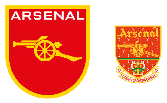
Arsenal grew out of an informal team formed by the workers from the Woolwich Arsenal munitions factory. What the recent redesign of Arsenal's crest has shown is that the badges can be updated with a fair degree of success. The badges have evolved and changed since each club's inception, and it is commercially and aesthetically sensible for that evolution and adaptation to continue.
All the clubs should isolate the key feature within the clutter of their faux mediaeval crests, and transform that into a clear and distinctive symbol. Over recent years, some clubs have begun to do this - Derby County with its ram, Chelsea with its lion. Another step in the exercise ought to be deciding what is unique to the club, and what is merely borrowed from the city. The most beautiful and memorable Arsenal shirt was the one that they won the double with in 1971 - the gun was a simple silhouette, white on the red. Although it's in the right area, the new badge disappoints in its detail. It's a made-up blobby cannon from a date about 100 years too early, not at all like the ones made by the Woolwich Arsenal. My design preserves the detail of the Woolwich Arsenal gun, and uses unusual squared-off letters taken from the outside wall of the Highbury stadium.
•••
Manchester United
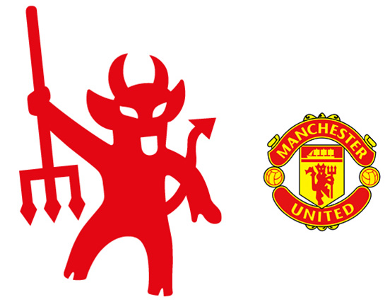
Any business as ambitious and well-known as Man. United is likely to experience 'brand stretch', moving beyond its origin as a football club into clothing, sports wear, publishing, even beer. Imagine the sales of Man. United branded boots and lager if David Beckham used them? Even without Beckham, with an estimated one million fans worldwide, the potential sales of a Man. United polo shirt sporting a dancing red devil must be painfully attractive. I am not even a fan and I would buy one.
There are a number of theories about why the devil first appeared on the Manchester United badge, but the most likely is that the team used to be called Newton Heath with the consequent nick-name 'The Heathens'. The devil was a kind of pun used to illustrate the nick-name. My design takes the flimsy, ragged devil that squats in the current badge, and redraws him as more assertive and with more character. An 'M' and a 'U' are also hidden in the design.
•••
Bolton Wanderers
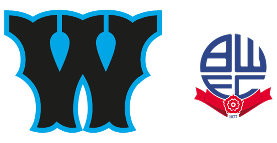
I would be shocked to learn that a graphic designer had been anywhere near the letters in the Bolton Wanderers badge - they look so awful. My guess is the Chairman's little son had a go.
Bolton, one of only two clubs in the premiership to have a badge made up of letters, should learn from the successes of American baseball teams over the last 100 years. The best known brand example is, the New York Yankees, which has a beautiful badge: a monogram of overlapping letters, an 'N' and a 'Y' recognisable to people who aren't even baseball fans. You can see people wearing it, usually on a baseball cap, in any high street in the Western world - Becks and Posh have a matching pair of caps. It's the Hilfiger of the sports world, and every sports team's identity should aim this high.
To illustrate my point, my design uses a beautiful and distinctive 'W' from a 'Tuscan' woodletter alphabet, more or less contemporary with the founding of the Wanderers (the New York Yankees use letters from a similar typeface).
•••
Sunderland
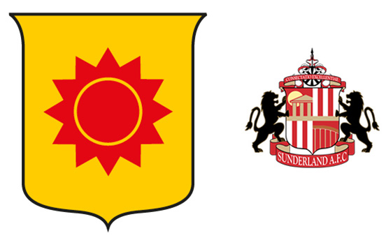
The Sunderland badge, designed in the late 90s, has absolutely everything in it. It's how Del-Boy would design a club badge. My design preserves the shield from the current design, which has a very attractive outline. The main emblem is a sun as they play in the 'Stadium of Light' after all. The sun represents optimism, power - it is eternal. It is also the 'Sun' in Sunderland! (Sunderland could do with some sun shining on it right now.) This approach is like an American Football club, which has a memorably direct relationship between their names and their symbols; the Dallas Cowboys have a big star, taken from Texas' famous lone star flag, the Minnesota Vikings sport two horns, one painted on each side of their helmets.
•••
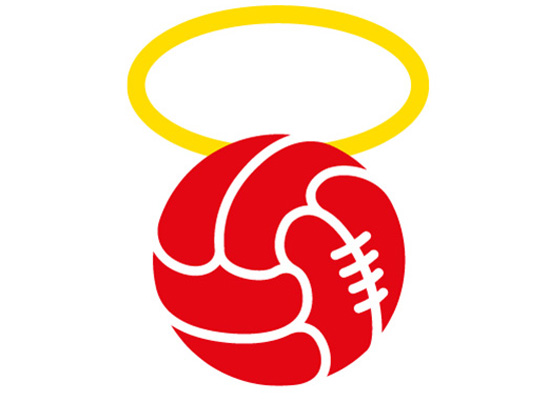
Southampton
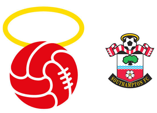
The current badge looks frighteningly close to Bertie Bassett, the bulging man made of Liquorice Allsorts. The halo is another wonderful chance to make a great symbol. The 'Saints' is a very potent idea that just needs the right emblem to express it. My design is very simple, no tree, no rose, no scarf, just a classic leather football from an old Southampton badge, and a halo. (If your badge has a football, and you alter it every time the FA brings out a new ball design, you'll soon be changing it every season.)
•••
THE WRITER
Quentin Newark is a founding partner of design studio Atelier Works; called by Jonathan Glancey of the Guardian "the fashionable London design agency".
In just the last three years, the studio has won over thirty awards for its design work. Current projects include rebranding the Royal Institute of British Architects, and a stone sundial outside the Houses of Parliament. Other clients have included the Tate, the Design Council, Deutsche Bank and Volkswagen. They designed the Labour Party manifesto for the 2001 election.
Newark has just written his first book: What is Graphic Design? published by RotoVision. He was chosen as one of 'the ten leading graphic designers in Britain' by the Independent on Sunday.